the Creative Commons Attribution 4.0 License.
the Creative Commons Attribution 4.0 License.
 | 08 Oct 2021
Unsupervised classification of simulated magnetospheric regions
Maria Elena Innocenti
Jorge Amaya
Joachim Raeder
Romain Dupuis
Banafsheh Ferdousi
Giovanni Lapenta
In magnetospheric missions, burst-mode data sampling should be triggered in the presence of processes of scientific or operational interest. We present an unsupervised classification method for magnetospheric regions that could constitute the first step of a multistep method for the automatic identification of magnetospheric processes of interest. Our method is based on self-organizing maps (SOMs), and we test it preliminarily on data points from global magnetospheric simulations obtained with the OpenGGCM-CTIM-RCM code. The dimensionality of the data is reduced with principal component analysis before classification. The classification relies exclusively on local plasma properties at the selected data points, without information on their neighborhood or on their temporal evolution. We classify the SOM nodes into an automatically selected number of classes, and we obtain clusters that map to well-defined magnetospheric regions. We validate our classification results by plotting the classified data in the simulated space and by comparing with k-means classification. For the sake of result interpretability, we examine the SOM feature maps (magnetospheric variables are called features in the context of classification), and we use them to unlock information on the clusters. We repeat the classification experiments using different sets of features, we quantitatively compare different classification results, and we obtain insights on which magnetospheric variables make more effective features for unsupervised classification.
- Article
(19316 KB) - Full-text XML
-
Supplement
(2370 KB) - BibTeX
- EndNote


The growing amount of data produced by measurements and simulations of different aspects of the heliospheric environment has made it fertile ground for applications rooted in artificial intelligence, AI, and machine learning, ML (Bishop, 2006; Goodfellow et al., 2016). The use of ML in space weather nowcasting and forecasting is addressed in particular in Camporeale (2019). ML methods promise to help sort through the data and find unexpected connections and can, hopefully, assist in advancing scientific knowledge.
Much of the AI/ML effort in space physics is directed at the Sun itself, either in the form of classification of solar images (Armstrong and Fletcher, 2019; Love et al., 2020) or for the forecast of transient solar events (see Bobra and Couvidat, 2015; Nishizuka et al., 2017; Florios et al., 2018, and references therein). This is not surprising, since the Sun is the driver of the heliospheric system and the ultimate cause of space weather (Bothmer and Daglis, 2007). Solar imaging is also one of the fields in science where data are being produced at an increasingly faster rate (see Fig. 1 in Lapenta et al., 2020).
Closer to Earth, the magnetosphere has been sampled for decades by missions delivering an ever-growing amount of data, although magnetospheric missions are still far away from producing as much data as solar imaging. The four-spacecraft Cluster mission (Escoubet et al., 2001) has been investigating the Earth's magnetic environment and its interaction with the solar wind for over 20 years. Laakso et al. (2010), introducing a publicly accessible archive for high-resolution Cluster data, expected it to exceed 50 TB. The Magnetospheric Multiscale Mission (MMS; Burch et al., 2016) is a four-spacecraft mission launched in 2015 with the objective of investigating the microphysics of magnetic reconnection in the terrestrial magnetotail and magnetopause. It collects a combined volume of ∼100 gigabits per day of particle and field data, of which only about four can be transmitted to the ground due to downlink limitations (Baker et al., 2016). The Time History of Events and Macroscale Interactions during Substorms (THEMIS) mission (Angelopoulos, 2009) is composed of five spacecraft launched in 2007 to investigate the role of magnetic reconnection in triggering substorm onset. It produces ∼2.3 gigabits of data per day. Comparing THEMIS and MMS, we have seen an increase in the volume of data produced, of almost 2 orders of magnitude, in just 8 years.
Several studies have applied classification techniques to different aspects of the near-Earth space environment. Supervised classification has been extensively used for the detection and classification of specific processes or regions. An incomplete list of recent examples includes the detection and classification of magnetospheric ultra-low frequency waves (Balasis et al., 2019), the detection of quasi-parallel and quasi-perpendicular magnetosheath jets (Raptis et al., 2020), and the detection of magnetopause crossings (Argall et al., 2020). Supervised techniques have also been used for the classification of large-scale geospace regions, such as the solar wind, the magnetosheath, the magnetosphere, and ion foreshock in Olshevsky et al. (2019), the solar wind, ion foreshock, bow shock, magnetosheath, magnetopause, boundary layer, magnetosphere, plasma sheet, plasma sheet boundary layer, and lobe in Breuillard et al. (2020), and magnetosphere, magnetosheath, and solar wind in MMS data in Nguyen et al. (2019); da Silva et al. (2020). In the context of kinetic physics, Bakrania et al. (2020) have applied dimensionality reduction and unsupervised clustering methods to the magnetotail electron distribution in pitch angle and energy space and have identified eight distinct groups of distributions related to different plasma dynamics.
Almost all the magnetospheric classification studies mentioned above use supervised classification methods. Supervised classification relies on the previous knowledge and input of human experts. The accuracy of these methods comes from the use of known correlations between inputs and the corresponding output classes presented to the algorithm during the training phase. Supervised classification is sometimes made unpractical by the need to label large amounts of data for the training phase. In magnetospheric studies, this is often less of an issue due to the widespread availability of labeled magnetospheric data sets such as, for example, data tagged by the MMS “scientist in the loop” (Argall et al., 2020). However, the personal biases of the particular scientist labeling the data limit the ability of the algorithms to detect new and previously unknown patterns in the data.
On the other hand, unsupervised machine learning models can discern patterns in large amounts of unlabeled data without human intervention and the associated biases. Clustering techniques separate data points into groups that share similar properties. Each cluster is represented by a mean value or by a centroid point. A good clustering technique will produce a set of centroids with a distribution in data space that closely resembles the data distribution of the full data set. This allows us to differentiate groups of points in the data space and to identify dense distributions. Unsupervised methods are particularly useful for discovering data patterns in very large data sets composed of multidimensional (i.e., characterized by multiple variables) properties, without having any kind of input from human experts. This is an unbiased, automatic approach to discover hidden information in large simulation and observation data sets. In other words, while supervised ML can be useful for applying known methods to a broader set of data, unsupervised ML holds the promise of achieving a true discovery or new insight.
Here, we explore an unsupervised classification method for simulated magnetospheric data points based on self-organizing maps (SOMs). Simulated data points are used to train a SOM, whose nodes are then clustered into an optimal number of classes. A posteriori, we try to map these classes to recognizable magnetospheric regions.
The objective of this work is to understand if the method we propose can be a viable option for the classification of magnetospheric spacecraft data into large-scale magnetospheric regions. We also aim at gaining insights into the specifics of the magnetospheric system (which are the best magnetospheric variables to use to train the classifiers? Which is the optimal cluster number?) that can later help us to extend our work to spacecraft data. At the current stage, we move our first steps in the controlled and somehow easily understandable environment of simulations, where time–space ambiguities are eliminated, and one can validate classification performance by plotting the classified data point in the simulated space. In Sect. 2, we recall the main characteristics of the OpenGGCM-CTIM-RCM code and the global MagnetoHydroDynamics (MHD) code used in this study to simulate the magnetosphere, and we show some preliminary analysis of the data we obtain. A brief description of the SOM algorithm is provided in Sect. 3. In Sect. 4, we illustrate our classification methodology. In Sect. 4.1, we analyze a classification experiment done with one particular set of magnetospheric features (we call these magnetospheric variables “features” in the context of classification), and we realize that our unsupervised classification results agree to a surprisingly degree with what a human would do. In Sect. 4.2, we focus on model validation and, in particular, on temporal robustness and on comparison with another unsupervised classification method. In Sect. 4.3, we examine different sets of features for the SOM training. We obtain alternative (but still physically significant) classification results, and some insights into what constitutes a good set of features for our classification purposes. The discussions and conclusions follow.
Further information of interest is provided in Appendix A, where we report on a manual exploration of the SOM hyperparameter space, and in Appendix B, where we assess how robust our classification method is by changing the number of k-means clusters used to classify the SOM nodes.
The global magnetospheric simulations are produced with the OpenGGCM-CTIM-RCM code, a MHD-based model that simulates the interaction of the solar wind with the magnetosphere–ionosphere–thermosphere system. OpenGGCM-CTIM-RCM is available at the Community Coordinated Modeling Center at NASA Goddard Space Flight Center (GSFC) for model runs on demand. A detailed description of the model and typical examples of OpenGGCM applications can be found in Raeder (2003), Raeder et al. (2001b), Raeder and Lu (2005), Connor et al. (2016), Raeder et al. (2001a), Ge et al. (2011), Raeder et al. (2010), Ferdousi and Raeder (2016), Dorelli (2004), Raeder (2006), Berchem et al. (1995), Moretto et al. (2006), Vennerstrom et al. (2005), Anderson et al. (2017), Zhu et al. (2009), Zhou et al. (2012), and Shi et al. (2014), to name a few. Of particular relevance to this study is OpenGGCM-CTIM-RCM simulations that have recently been used for a domain of influence analysis, a technique rooted in data assimilation that can be used to understand what the most promising locations are for monitoring (i.e., spacecraft placing) in a complex system such as the magnetosphere (Millas et al., 2020).
OpenGGCM-CTIM-RCM uses a stretched Cartesian grid (Raeder, 2003), which in this work has cells, sufficient for our large-scale classification purposes, while running for few hours on a modest number of cores. The point density increases in the sunward direction and in correspondence with the magnetospheric plasma sheet, an interesting region of the simulation for our current purposes. The simulation extends from −3000 RE to 18 RE in the Earth–Sun direction and from −36 to +36 RE in the y and z direction. RE is the Earth's mean radius, and the Geocentric Solar Equatorial (GSE) coordinate system is used in this study.
In this work, we do not classify points from the entire simulated domain. We focus on a subset of the points with coordinates , i.e., the magnetosphere–solar wind interaction region and the near-Earth magnetotail.
The OpenGGCM-CTIM-RCM boundary conditions require the specification of the three components of the solar wind velocity and magnetic field, the plasma pressure, and the plasma number density at 1 AU. Boundary conditions in the sunward direction vary with time. They are interpolated to the appropriate simulated time from ACE observations (Stone et al., 1998) and applied identically to the entire sunward boundary. At the other boundaries, open boundary conditions (i.e., zero normal derivatives) are applied, with appropriate corrections to satisfy the condition.
For this study, we initialize our simulation with solar wind conditions observed, starting from 8 May 2004, 09:00 UTC (universal coordinated time), denoted as t0. After a transient, the magnetosphere is formed by the interaction between the solar wind and the terrestrial magnetic field.
We classify simulated data points from the time t0+210 min, when the magnetosphere is fully formed. We later compare our results with earlier and later times, namely t0+150 and 225 min. In Fig. 1, we show significant magnetospheric variables at t0+210 min, in the xz plane at (meridional plane), namely the three components of the magnetic field Bx, By, and Bz, the three velocity components vx, vy, and vz, the plasma density n, pressure pp, temperature T, the Alfvén speed vA, the Alfvénic Mach number MA, and the plasma β. Magnetic field lines (more precisely, lines tangential to the field direction within the plane) are drawn in black. Panels (g) to (l) in Fig. 1 are in logarithmic scale.
We expect the algorithm to identify well-known domains such as pristine solar wind, magnetosheath, lobes, inner magnetosphere, plasma sheet, and boundary layers, which can be clearly identified in these plots. The classification is done for points from the entire 3D volume and not only for 2D cuts such as the one shown.
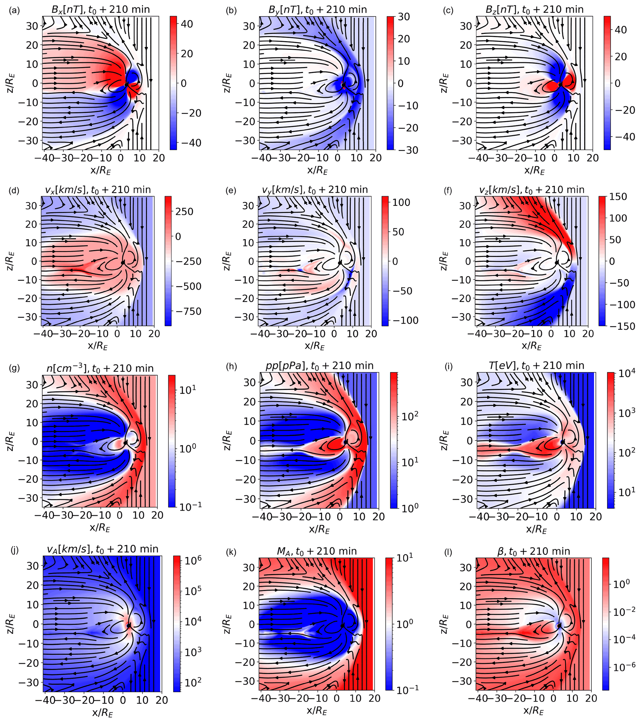
Figure 1Simulated magnetospheric variables in the , meridional, plane and at t0+210 min. The different magnetospheric regions are evident. Magnetic field lines are depicted as black arrows.
In Fig. 2, we depict the violin plots for the variables in Fig. 1. Violin plots are useful tools to visualize, at a glance, the distribution of feature values, as they depict the probability density of the data at different values. In violin plots, the shape of the violin depicts the frequency of occurrence of each feature; the thicker regions of the violin are where most of the observations lie. The white dot, the thick black vertical lines, and the thin vertical lines (the whiskers) separating the blue and orange distributions depict the median, the interquartile range, and the 95 % confidence interval, respectively. In total, 50 % of the data lie in the region highlighted by the thick black vertical lines; 95 % of the data lie in correspondence of the whiskers. The left and right sides of the violins depict distributions at different times. The left side, in blue, depicts data points from t0+210 min. The right side, in orange, depicts a data set composed of points from multiple snapshots, t0+125, 175, and 200 min, and intends to give a visual assessment of the variability in the distribution of magnetospheric properties with time. The width of the violins is normalized to the number of points in each bin.
In the simulations, points closer to Earth correctly exhibit very high magnetic field values, up to several microtesla (hereafterµT). In the violin plots, for the sake of visualization, the magnetic field components of points with nT have been clipped to nT, multiplied by their respective sign (hence the accumulation of points at nT in the magnetic field components). The multi-peaked distribution of several of the violins reflects the variability in these parameters across different magnetospheric environments. Multi-peaked distributions bode well for classification, since they show that the underlying data can be inherently divided in different classes.
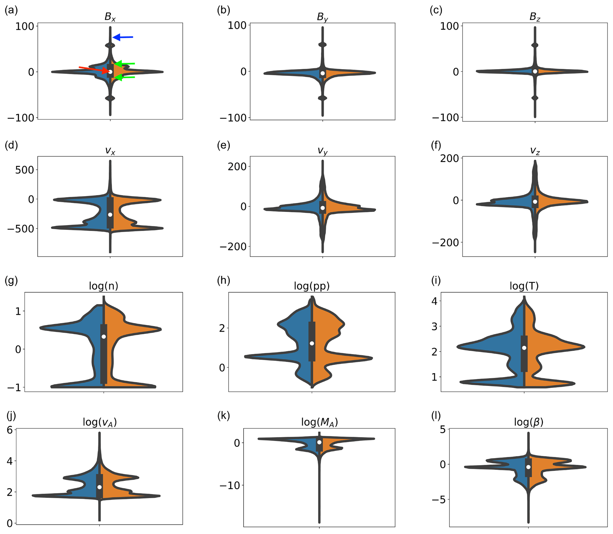
Figure 2Violin plots of the data sets extracted from the magnetospheric simulations. The left sides of the violins, in blue, are data points at t0+210 min, and the right, in orange, are from t0+125, 175, and 200 min. In the Bx plot, the red, green, and blue arrows point at the median, first and third quartiles, and whiskers, respectively.
To classify magnetospheric regions, we use self-organizing maps (SOMs), an unsupervised ML technique. Self-organizing maps (Kohonen, 1982; Villmann and Claussen, 2006; Kohonen, 2014; Amaya et al., 2020), also known as Kohonen maps or self-organizing feature maps, are a clustering technique based on a neural network architecture. SOMs aim at producing an ordered representation of data, which in most cases has lower dimensionality with respect to the data itself. “Ordered” is a key word in SOMs. The topographical relations between the trained SOM nodes are expected to be similar to those of the source data; data points that map to nearby SOM nodes are expected to have similar features. Each SOM node then represents a local average of the input data distribution, and nodes are topographically ordered according to their similarity relations (Kohonen, 2014).
A SOM is composed of the following:
-
A (usually) two-dimensional lattice of nodes, with Lr and Lc as the number of rows and columns. This lattice, also called a map, is a structured arrangement in which all nodes are located in fixed positions, pi∈ℝ2, and are associated with a single code word, wi. As it is often done with two-dimensional SOM lattices, the nodes are organized in an hexagonal grid (Kohonen, 2014).
-
A list of q code words , where n is the number of features associated to each data point (and, hence, to each code word). n is therefore the number of plasma variables that we select, among the available ones, for our classification experiment. Each wi is associated with a map node pi
Each of the m input data points is a data entry xτ∈ℝn. Notice that, in the rest of the paper, we will use terms such as “data point”, “data entry”, and “input point” interchangeably. Given a data entry xτ, the closest code word in the map, ws (Eq. 1), is called the winning element, and the corresponding map node ps is the best matching unit (BMU).
is the distance metric. In this work, we use the Euclidean norm.
SOMs learn by moving the winning element and neighboring nodes closer to the data entry, based on their relative distance, and on a iteration-number-dependent learning rate ϵ(τ), with τ the progression of samples being presented to the map for training. The feature values of the winning element are altered so as to reduce the distance between the updated winning element and the data entry. The peculiarity of the SOMs is that a single entry is used to update the position of several code words in feature space, the winning nodes, and its nearest neighbors. Code words move towards the input point at a speed proportional to the distance of their correspondent lattice node position to the winning node.
It is useful to compare the learning procedure in SOMs and in another, perhaps better known, unsupervised classification method, namely k-means (Lloyd, 1982). Both SOMs and k-means classification identify and modify the best matching unit for each new input. In k-means, only the winner node is updated. In SOMs, the winner node and its neighbors are updated. This is done to obtain an ordered distribution; nearby nodes, notwithstanding their initial weights, are modified during training as to become more and more similar.
At every iteration of the method, the code words of the SOM are shifted according to the following rule:
with defined as the lattice neighbor function as follows:
where σ(τ) is the iteration-number-dependent lattice neighbor width. The training of the SOM is an iterative process. At each iteration, a single data entry is presented to the SOM, and code words are updated accordingly. The radius of the neighboring function σ(τ) determines how far from the winning node the update introduced by the new input will extend. The learning rate ϵ(τ) gives a measure of the magnitude of the correction. Both are slowly decreased with the iteration number. At the beginning of the training, the update introduced by a new data input will extend to a large number of nodes (large σ), which are significantly modified (large ϵ), since it is assumed that the map node does not represent the input data distribution well. At large iteration numbers, the nodes are assumed to have already become more similar to the input data distribution, and lower σ and ϵ are used for fine tuning.
In this work, we choose to decrease σ and ϵ with the iteration number. Another option, which we do not explore, is to divide the training into two stages, i.e., coarse ordering and final convergence, with different values of σ and ϵ.
However small, σ has to be kept larger than 0, otherwise only the winning node is updated, and the SOM loses its ordering properties (Kohonen, 2014).
This learning procedure ensures that neighboring nodes in the lattice are mapped to neighboring nodes in the n-dimensional feature space. The 2D maps obtained can then be graphically displayed, allowing us to visually recognize patterns in the input features and to group together points that have similar properties (see Fig. 5).
The main metric for the evaluation of the SOM is the quantization error, which measures the average distance between each of the m entry data points and its BMU and, hence, how closely the map reflects the training data distribution.
For our unsupervised classification experiments, we initially focus on a single temporal snapshot of the OpenGGCM-CTIM-RCM simulation, t0+210 min. Although the simulation domain is much larger, we restrict our input data set to the points with (see Fig. 1), since we are particularly interested in the magnetospheric regions more directly shaped by interaction with the solar wind. We select 1 % of the 5 557 500 data points at and min as the training data set. The selection of these points is randomized, and the seed of the random number generator is fixed to ensure that results can be reproduced. Tests with different seeds and with a higher number of training points did not give significantly different classification results.
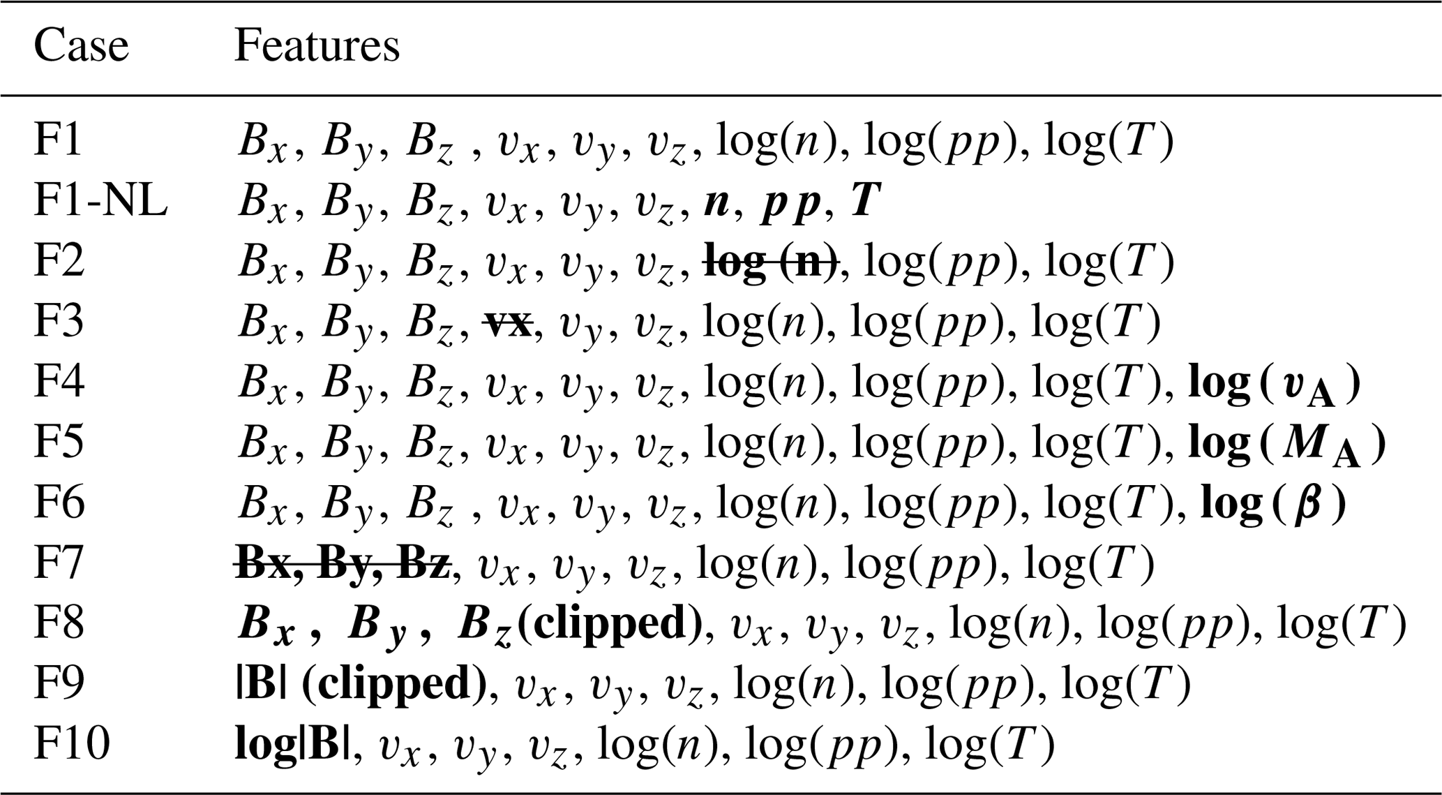
In Fig. 3a, we plot the correlation matrix of the training data set. This and all subsequent analyses, unless otherwise specified, are done with the feature list labeled as F1 in Table 1, i.e., the three components of the magnetic field and of the velocity, the logarithm of the density, pressure, and temperature. In Table 1, we describe the different sets of features used in the classification experiments described in Sect. 4.3. Each set of feature is assigned an identifier (case); the list of magnetospheric variables used in each case is listed under “features”. Differences with respect to F1 are marked in bold.
Table 1Combination of features (cases) used for the different classification experiments. We mark differences with respect to F1, our reference feature set, in bold.
The correlation matrix shows the correlation coefficients between a variable and all others, including itself (the correlation coefficient of a variable with itself is, of course, 1). We notice that, in the bottom right of the matrix, correlation is high between logarithm of density, logarithm of pressure, logarithm of temperature, and velocity in the Earth–Sun direction. This suggests that a lower-dimension feature set can be obtained that still expresses a high percentage of the original variance. Using a lower dimensional training data set is desirable, since it reduces the training time of the map.
At this stage of our investigation, we use principal component analysis (PCA) (Shlens, 2014) as a dimensionality reducing tool. More advanced techniques, and in particular techniques that do not rely on linear correlation between the features, are left for future work.
First, the variables are scaled between two fixed numbers, here 0 and 1, to prevent those with larger ranges from dominating the classification. Then, we use PCA to extract linearly independent principal components, PCs, from the set of original variables. We keep the first three PCs, which express 52 %, 35 %, and 5.4 % of the total variance, thus retaining 93 % of the initial variance. We plot in Fig. 3b–d (left; blue half-violins) the violin plots of these scaled components. For a visual assessment of temporal variability in the simulations, we show (right; orange half-violins) the first three PCs of the mixed time data set, where data points are taken at t0+125, 175, and 200 min. We see a difference, albeit small, between the two sets, which explains the different classification results with fixed and mixed time data sets that we discuss in Sect. 4.3. Notice that, by comparing the blue and orange half-violins in panel (b), that PC0 is rotated around the median value in the two data sets, which is possible for components reconstructed through linear PCA.
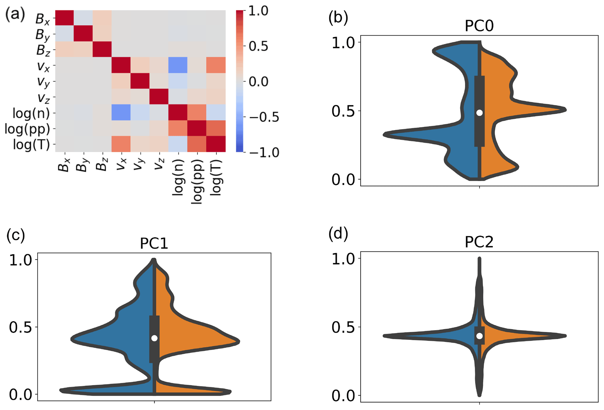
Figure 3Correlation plot for the fixed time training data set at time t0+210 min (a). Violin plots of the first three PCs after PCA for the fixed (left; blue half-violins) and mixed (right; orange half-violins) time data sets (b–d) are shown.
To investigate which of the features contribute most to each PC, we show, in Table 2, the F1 feature set, which is the eigenvectors associated with the first three PCs (rows). Each column corresponds to one feature. The three most relevant features for each PC are marked in bold.
Table 2Eigenvectors associated with the first three PCs (rows), for each of the F1, clipped F1, and clipped F9 features in Table 1 (columns). The first most relevant features for each PC are marked in bold.
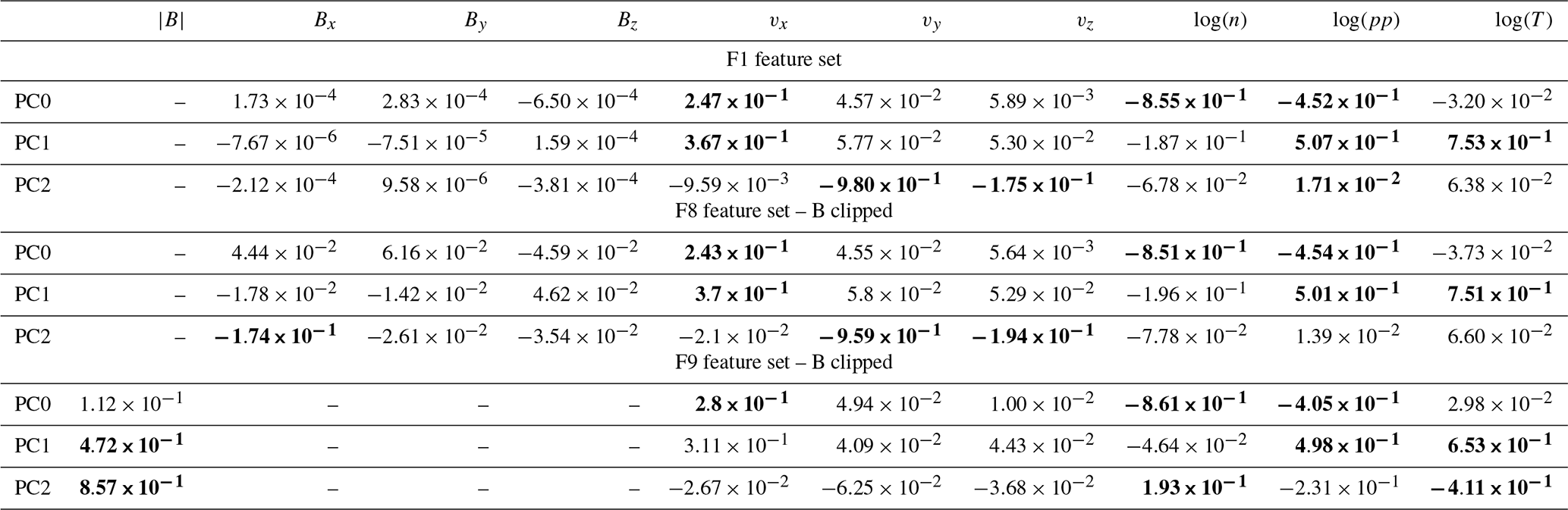
The three most significant F1 features for PC0 are the logarithm of the density, of the pressure, and the velocity in the x direction; for PC1 it is the logarithm of the temperature, of the pressure, and the velocity in the x direction; and for PC2 it is the velocity in the y direction, in the z direction, and the logarithm of the plasma pressure. We see that the three magnetic field components rank the lowest in importance for all the three PCs.
This last result is, at first glance, quite surprising, given the fundamental role of the magnetic field in magnetospheric dynamics. We can explain it by looking at the violin plots in Fig. 2. There, we see that the magnetic field distributions are quite simple when compared to the multi-peak distributions of more significant features such as density, pressure, temperature, and vx. Still, one may argue that the very high values of the magnetic field close to Earth distort the magnetic field component distributions and reduce their weight in determining the PCs. In Table 2 (F8 feature set – B clipped), we repeat the analysis clipping the magnetic field values as in Fig. 2. The intention of the clipping procedure is to cap the maximum magnitude of the magnetic field module to 100 nT, while retaining information on the sign of each magnetic field component.
Also now, the magnetic field does not contribute significantly to determining the PCs.
In Table 2 (F9 feature set – B clipped), we list the eigenvectors associated with the first three PCs for the F9 feature set. We see that now the clipped magnetic field magnitude ranks higher than with the F1 feature set and the F8 feature set (B clipped) in determining the PCs and becomes relevant, especially for PC1 and PC2. In the violin plots of the PCs for F9, not shown here, we see that PC0 is not significantly different in F1 and F9, while PC1 and PC2 are. In particular, PC2 for F9 exhibits more peaks than PC2 for F1.
The first three PCs obtained from the F1 feature list (without magnetic field clipping) are used to train a SOM. Each of the data points is processed and classified separately, based solely on its local properties, at t0+210 min. We consider this local approach one of the strengths of our analysis method, which makes it particularly appealing for spacecraft onboard data analysis purposes.
The procedure for the selection of the SOM hyperparameters is described in Appendix A. At the end of it, we choose the following hyperparameters: nodes, initial learning rate ϵ0=0.25, and initial lattice neighbor width σ0=1.
After the SOM is generated, its nodes are further classified using k-means clustering in a predetermined number of classes. Data points are then assigned to the same cluster as their BMU.
The overall classification procedure can then be summarized as follows:
-
data pre-processing (feature scaling, dimensionality reduction via PCA, and scaling of the reduced values),
-
SOM training,
-
k-means clustering of the SOM nodes, and
-
classification of the data points, based on the classification of their BMU.
It is useful to remark that, even if the same data are used to train different SOMs, the trained networks will differ due, e.g., to the stochastic nature of artificial neural networks and to their sensitivity to initial conditions. If the initial positions of the map nodes are randomly set (as in our case), maps will evolve differently, even if the same data are used for the training.
To verify that our results do not correspond to local minima, we have trained different maps seeding the initial random node distribution with different seed values. We have verified that the trained SOMs generated in this way give comparable classification results, even if the nodes that map to the same magnetospheric points are located at different coordinates in the map. The reason for this comparable classification results is that the net created by a well-converged SOM will always have a similar coverage, and neighboring nodes will always be located at similar distances with respect to their neighbors (if the training data do not change). Hence, while the final map might look different, the classes and their properties will produce very similar end results. We refer the reader to Amaya et al. (2020) for an exploration of the sensitivity of the SOM method to the parameters and to initial condition and for a study of the rate and speed of convergence of the SOM.
Our maps are initialized with random node distributions. It has been demonstrated that different initialization strategies, such as using as initial node values a regular sampling of the hyperplane spanned by the two principal components of the data distribution, significantly speed up learning (Kohonen, 2014).
4.1 Classification results and analysis
We describe in this section the results of a classification experiment with the feature set F1 from Table 1. After training the SOM, we proceed to node clustering. The optimal number of k-means classes k can be chosen by examining the variation in k of the within-cluster sum of squares (WCSSs), i.e., the sum of the squared distances from each point to their cluster centroid. The WCSS decreases as k increases; the optimal value can be obtained using the Kneedle (“knee” plus “needle”) class number determination method (Satopaa et al., 2011) that identifies the knee where the perceived cost to alter a system parameter is no longer worth the expected performance benefit. Here, the Kneedle method (Fig. 4a) gives k=7 as the optimal cluster number, i.e., a representative and compact description of feature variability.
The clustering classification results can be plotted in 2D space. Figure 4 shows, in panel d and e, points with and with that we identify, for simplicity, with the meridional and equatorial plane, respectively. The projected field lines are depicted in black; k=7, as per the results of the Kneedle method. The points are depicted in colors, with each color representing a class of classified SOM nodes. The dot density changes in different areas of the simulation because the grid used in the simulation is stretched, with increasing points per unit volume in the sunward direction and in the plasma sheet center. The (T) in the label is used to remind the reader that these points are the ones used for the training of the map. Plots of validation data sets will be labeled as (V).
The SOM map in Fig. 4c depicts the clustered SOM nodes. In Fig. 4b, the clusters are a posteriori mapped to different magnetospheric regions.
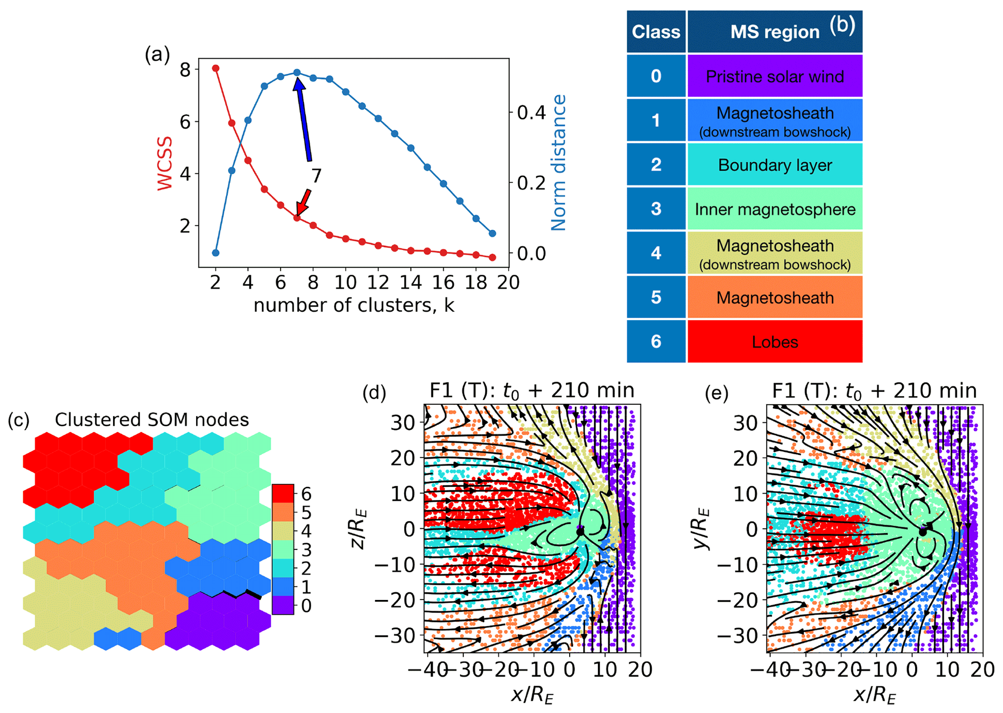
Figure 4(a) Kneedle determination of the optimal number of k-means clusters for the SOM nodes. WCSSs (left axis) is the within-cluster sum of squares, the maximum of the normalized distance (right axis) identifies the optimal cluster number (here k=7). (b) A posteriori class identification. (c) Clustered SOM nodes. (d, e) Classified points in the meridional and equatorial planes, respectively. In panels (b) to (e), k=7. The points depicted are the ones used for the training (T) of the map.
Comparing Figs. 4 and 1, we see that cluster 0, purple, corresponds to unshocked solar wind plasma. Clusters 4 (brown) and 1 (blue) map to the shocked magnetosheath plasma just downstream of the bow shock. Cluster 5 (orange) groups both points in the downwind supersonic magnetosheath, further downstream from the bow shock, and a few points at the bow shock. A possible explanation for this is that the bow shock is not in fact a vanishingly thin boundary but has a finite thickness. The points within this region of space would present characteristics intermediate between the unshocked solar wind and the shocked plasma just downstream of the bow shock, which are serendipitously very similar to those of other regions. Cluster 2, cyan, maps to boundary layer plasma. Cluster 3, green, corresponds to points in the inner magnetosphere.
The result of this unsupervised classification is actually quite remarkable because it corresponds quite well to the human identification of magnetospheric regions developed over decades on the basis of analysis satellite data and understanding of physical processes. Here, instead, this very plausible classification of magnetospheric regions is obtained without human intervention.
In Fig. 5, we plot the feature map associated with the classification in Fig. 4. While a good correspondence between the feature value at a SOM node and values at the associated data points can be expected for the features that contribute most to the first PCs, this cannot be expected with less relevant features, such as the three components of the magnetic field in this case (see the F1 feature set in Table 2 and the accompanying discussion). Keeping these considerations in mind while looking at the feature values across the map nodes in Fig. 5, we see that they correspond quite well with what we expect from the terrestrial magnetosphere.
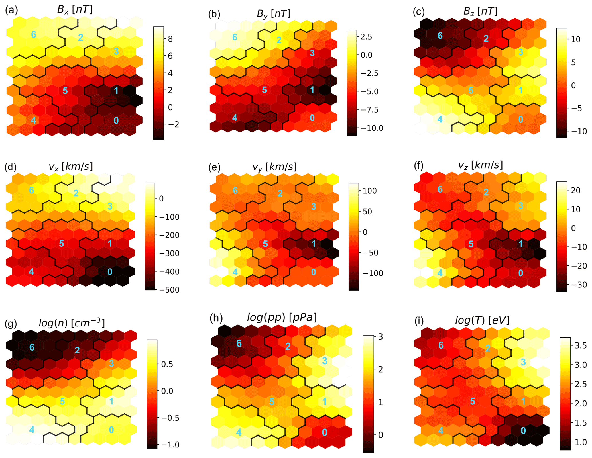
Figure 5Distribution of the feature values in the SOM map, with , σ0=1, and ϵ0=0.25. The cluster boundaries and numbers are for k=7 (Fig. 4). Cluster 0 corresponds to pristine solar wind, clusters 1, 4, and 5 to magnetosheath plasma, cluster 2 to boundary layers, cluster 3 to the inner magnetosphere, and cluster 6 to the lobes.
In particular, we see that the pristine solar wind (cluster 0 with k=7 in Fig. 4; bottom right corner of the map in Fig. 5) is well separated in terms of properties from the neighboring regions, especially when considering vx, plasma pressure, and temperature. This is because the plasma upstream a shock is faster, lower pressure, and colder than the plasma downstream. In a shock, we expect a higher density downstream of the shock. We see that, of the three magnetosheath clusters (clusters 1, 4, and 5 in Fig. 4; the cluster surrounding the bottom right cluster in Fig. 5), the two mapping to regions just downstream of the bow shock (clusters 1 and 4) have a higher density than the solar wind cluster. When moving from clusters 1 and 4 towards the lobes, i.e., into cluster 5, the density decreases.
Clusters 1 and 4 are associated with magnetosheath plasma immediately downstream of the bow shock. We see that their nodes have very similar values in terms of density, pressure, temperature, and vx, with the quantities mainly associated to the area downstream of the bow shock. They differ mainly in terms of the sign of the vz velocity components; the regions identified in Fig. 4 as cluster 4 (1) have mainly positive (negative) vz. This may be the reason why two nodes adjacent to cluster 4 but presenting vz<0 are carved out as cluster 1 in the map. We notice that, as a general rule, nodes belonging to the same cluster are expected to be contiguous in the SOM map, barring higher-dimension geometries which cannot be drawn in a 2D plane.
Other clusters that draw immediate attention are clusters 2 and 3, at the top right of the map, which are the only ones whose nodes include positive vx values (sunward velocity). These clusters map to boundary layers and the inner magnetosphere; the vx>0 nodes are associated with the earthwards fronts we see in Fig. 1d.
Finally, we remark on a seemingly strange fact. Lobe plasma is clustered in cluster 6, which maps in Fig. 5 to nodes associated to Bx>0 only. We can explain this with the negligible role that Bx has in determining the PCs for the F1 feature set (see the discussion in Sect. 4) and, hence, the map structure. We can expect that the feature map for features that rank higher in determining the PCs (here density, pressure, temperature, and vx) will be more accurate than for lower-ranking features.
4.2 Model validation
In this section, we address the robustness of the classification method when confronted with data from different simulated times (Sect. 4.2.1), and we compare it against a different unsupervised classification method (pure k-means classification) in Sect. 4.2.2.
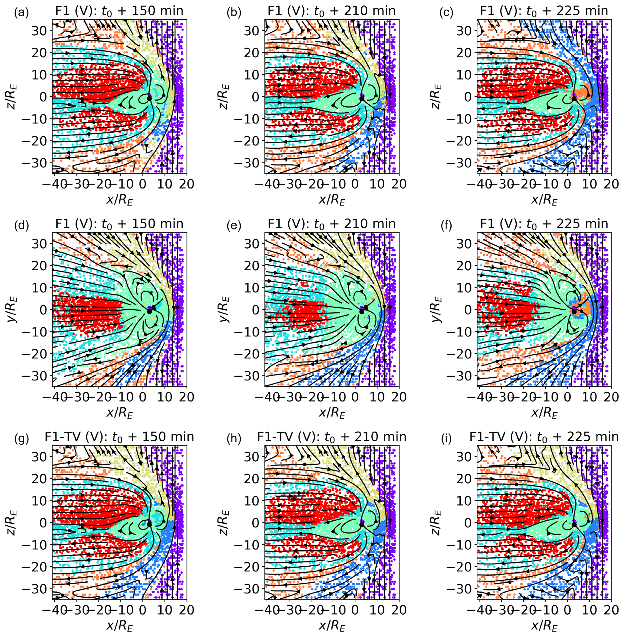
Figure 6Classification of validation (V) data sets in the meridional (a–c) and equatorial (d to f) planes at t0+150, t0+210, and t0+225 min. In panels (a)–(f), the points are classified with the same classifiers as in Fig. 4. Data points in panels (b) and (e) are from the same simulated time as the training set; those in panels (a), (c), (d), and (f) are from different times. Bz points northwards at t0+150 min and southwards at t0+210, which is 225 min. In panels (g)–(i), the classifiers are trained with a mixed time data set composed of points from t0+125, 175, and 200 min in feature set F1 TV.
4.2.1 Robustness to temporal variations
In Fig. 4, we plot classification results for the training set (T). Now, in Fig. 6, we move to validation sets (V), composed of different points from the same simulated time as the training set (Fig. 6b and e; t0+210 min), and of points from different simulated times (Fig. 6a and c; Fig. 6d and f; t0+150 and t0+225, respectively). While Fig. 6b and e show a straightforward sanity check, Fig. 6a and c aim at assessing how robust the classification method is to temporal variation. We want to verify how well classifiers trained at a certain time perform at different times and, in particular, under different orientations of the geoeffective component of the interplanetary magnetic field (IMF) Bz, which has well-known and important consequences for the magnetic field structure. Bz points southwards at time t0+210 and 225 min and northwards at t0+150 min.
The points classified in Fig. 6a–f are pre-processed and classified not only with the same procedure but also with the same scalers, SOM, and classifiers described in Sect. 4 and are trained on a subset of data from t0+210 min. Figure 6a to c depict points in the meridional plane and Fig. 6d to f in the equatorial plane.
While we can expect that the performance of classifiers trained at a single time will degrade when magnetospheric conditions change, it is useful information to understand how robust they are to temporal variation and which are the regions in the magnetosphere which are more challenging to classify correctly.
Examining Fig. 6b and e, we see that the classification results for the validation set at t0+210 min excellently match those obtained with the training set (Fig. 4). The classification outcomes at time t0+150 min (Fig. 6a and d) are also well in line with time t0+210. The biggest difference in the plots at t0+150 min, with t0+210, is in the southern magnetosheath region just downstream of the bow shock in the meridional plane. While this region is classified as cluster 1 at time t0+210, it is classified at time t0+150 min as clusters 1 or 4, and the other magnetosheath cluster downstream of the bow shock is mostly associated with the northern magnetosheath at time t0+210. In Fig. 6c, time t0+225 min, all magnetosheath plasma downstream of the bow shock is classified as cluster 1.
This result can be easily explained. Clusters 1 and 4 both map to shocked plasma downstream of the bow shock, i.e., regions with virtually identical properties in terms of the quantities that weigh the most in determining the PCs and, therefore, arguably,the SOM structure (plasma density, pressure, temperature, and vx). The features that could help in distinguishing between the northern and southern sectors, Bx and vz, rank very low in determining the first PCs and, hence, the SOM structure. On the other hand, exactly distinguishing via automatic classification between clusters 1 and 4 is not of particular importance, since the same physical processes are expected to occur in the two. Furthermore, a quick glance at the spacecraft spatial coordinates can clarify in which sector it is.
Relatively more concerning is the fact that several points in the sunward inner magnetosphere at time t0+225 min are identified as inner magnetosheath plasma in Fig. 6c and f. While training the SOM with several feature combinations in Sect. 4.3, we notice that this particular region is perhaps the most difficult to classify correctly, especially in cases, like this one, where the classifiers are trained at a different time with respect to the classified points. A possible explanation for this particular misclassification comes from Fig. 1. There, we notice that the plasma density and pressure in the sunwards inner magnetospheric regions have values compatible with those of certain inner magnetosheath regions. This may have pulled the nodes mapping to the two regions close in the SOM, and in fact, we see that clusters 3 and 5 are neighbors in the feature maps of Fig. 5.
In Fig. 6g–i, we explore classification results in the case of a mixed time (time variable – TV) training data set, in the meridional plane only.
In our visualization procedure, the cluster number (and, hence, the cluster color) is arbitrarily assigned. Hence, clusters mapping to the same magnetospheric regions may have different colors in classification experiments with different feature sets. For easier reading, we match a posteriori the cluster colors in the different classification experiments to those in Fig. 4.
Contrary to what was shown before, now we train our map with points from three different simulated times, namely t0+125, 175, and 200 min. The features used are the F1 feature set, and the map hyperparameters are , ϵ0=0.25, and σ0=1. The classified data points are a validation set from , 210, and 225 min. We see that the classification results agree quite well with those shown in Fig. 6a–c. One minor difference is the fact that the two magnetosheath clusters just downstream of the box shock do not change significantly with time in Fig. 6d to f, while they did so in Fig. 6a to c. Another difference can be observed in the inner magnetospheric region. In Fig. 6c, inner magnetospheric plasma at t0+225 was misclassified as magnetosheath plasma. In Fig. 6g, inner magnetospheric plasma at t0+150 min is misclassified as boundary layer plasma, which is possibly a less severe misclassification. In Fig. 6i, the number of misclassified points in the inner magnetosphere is negligible with respect to Fig. 6c.
4.2.2 Comparison with different unsupervised classification methods
Another form of model validation consists of comparing classification results with those from another unsupervised classification model. Here, we compare with pure k-means classification.
In Fig. 7 we present, in panels (a), (b), and (c), the classification results for the , , and planes at time t0+210 min (panels b and c are reproduced here from Fig. 4 for ease of reading). We contrast them in panels (d), (e), and (f) with k-means classification and also with k=7, using the same features and in the same planes.
Comparing panels (a) and (d), (b) and (e), and (c) and (f) in Fig. 7, we see that the two classification methods give quite similar results. We had remarked, in Fig. 4, on the fact that few points, possibly located inside the bow shock, are classified as inner magnetosheath plasma (orange). We notice that the same happens in In Fig. 7d–f.
One difference between the two methods is visible in panels (b) and (e): the magnetosheath cluster associated to the northern sector extends a few points further southwards in panel (e) than in panel (b). This is a minimal difference that can be explained with the fact that the two clusters map to very similar plasma, as remarked previously.
A rather more significant difference can be seen when comparing panel (c) and (f). In panel (f), some plasma regions rather close to Earth and deep into the inner magnetosphere are classified as magnetosheath plasma (brown) rather than as inner magnetospheric plasma (green). In panel (c), they are classified as the latter (green), which is a classification that appears more appropriate for the region, given its position.
To compare the two classification methods quantitatively, we calculate the number of points which are classified in the same cluster with a SOMs plus k-means vs. pure k-means classification. A total of 92.15 % of the points are classified in the same cluster, and 92.74 % of the two magnetosheath clusters just downstream of the bow shock are considered the same. These percentages are calculated on the entire training data set at time t0+210 min, of which cuts are depicted in the panels in Fig. 7.
We, therefore, conclude that the classification of SOM nodes and simple k-means classification globally agree. An advantage of using SOM with respect to k-means is that the former reduces the misclassification of a section of inner magnetospheric plasma, which is the region most challenging to classify correctly. Furthermore, SOM feature maps give a better representation of feature variability within each cluster than k-means centroids. This representation can be used to assess feature variability within the cluster. In k-means, only the feature values at the centroid (meaning, one value per class) are available.
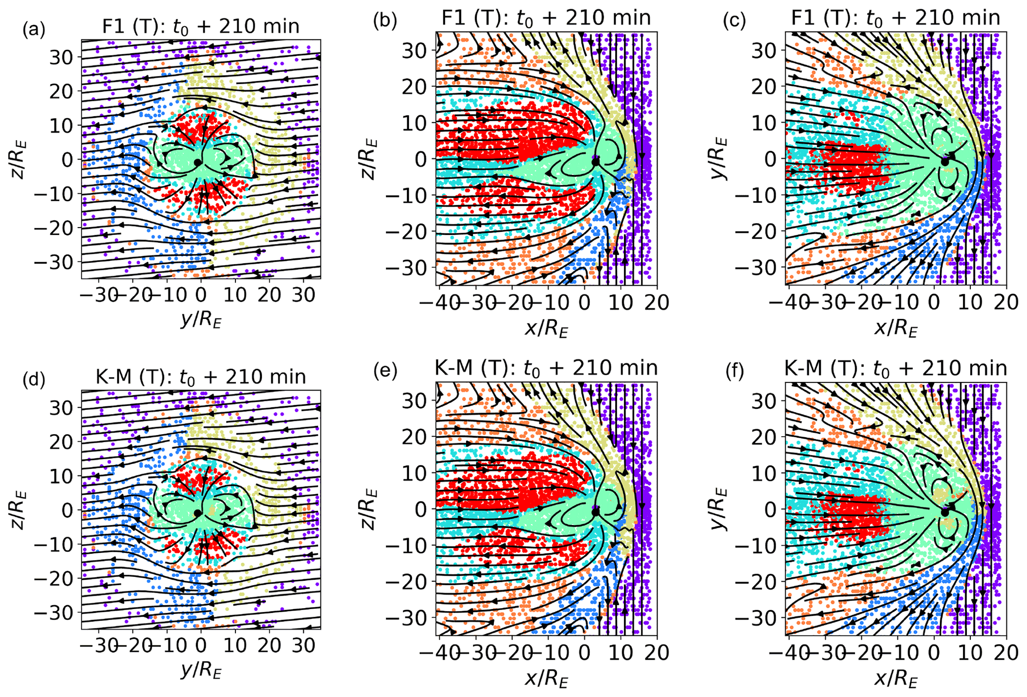
Figure 7Unsupervised k-means classification of trained SOM nodes, with k=7 (a–c), and pure k-means classification, with k=7 (d–f). The feature set is F1, and the time is t0+210 min. The training (T) data set is depicted.
4.3 On the choice of training features
Up to now, we have used the three components of the magnetic field and of the velocity and the logarithms of the plasma density, pressure, and temperature as features for SOM training. We label this feature set F1 in Table 1, where we list several other feature sets with which we experiment. In this section, we show classification results for different feature sets, listed in Table 1, and we aim at obtaining some insights into what constitutes a good set of features for our classification purposes.
The SOM hyperparameters are the same in all cases, i.e., , σ0=1, and ϵ0=0.25. In all cases, k=7. The data used for the training are from t0+210 min. In Figs. 8, 9, and 10, validation (V) data sets are depicted.
In Fig. 8a–c, we show sub-standard classification results obtained with non-optimal feature sets. In panel (a), F1 NL (not logarithm) uses density, pressure, and temperature rather than their logarithms. In panel (b), F2, we eliminate the logarithm of the plasma density from the feature list, i.e., the most relevant feature for the calculation of the PCs for F1. In panel (c), F3, we do not use the Sun–Earth velocity. We see that F1 NL groups together magnetosheath and solar wind plasma (probably the biggest possible classification error), and inner magnetospheric regions are not as clearly separated as in F1. F2 mixes inner magnetospheric and boundary layer data points (green and cyan) and magnetosheath regions just downstream of the bow shock and internal magnetosheath regions (orange). With F3, some inner magnetospheric plasma is classified as magnetosheath plasma, which is already at t0+210 min.
When analyzing satellite data, variables such as the Alfvén speed vA, the Alfvén Mach number MA, and the plasma beta β provide precious information on the state of the plasma. In Fig. 8d–f, we show training set results for the F4, F5, and F6 feature sets, where we add to our usual feature list, F1, and the logarithm of vA, MA, and β, respectively. Using as features the logarithm of variables, such as n, pp, T, vA, MA, and β, which vary across orders of magnitude (see Fig. 1), is one of the lessons learned from Fig. 8a. Comparing Fig. 8d–f with Fig 4, we see that introducing log (vA) in the feature list slightly alters the classification results. What we called the boundary layer cluster in Fig. 4 does not include, in F4, points at the boundary between the lobes and the magnetosheath. Perhaps more relevant is the fact that the boundary layer and inner magnetospheric clusters (green and cyan) appear to be less clearly separated than in F1. The classification obtained with F5 substantially agrees with F1. With F6, the boundary layer cluster is slightly modified with respect to F1.
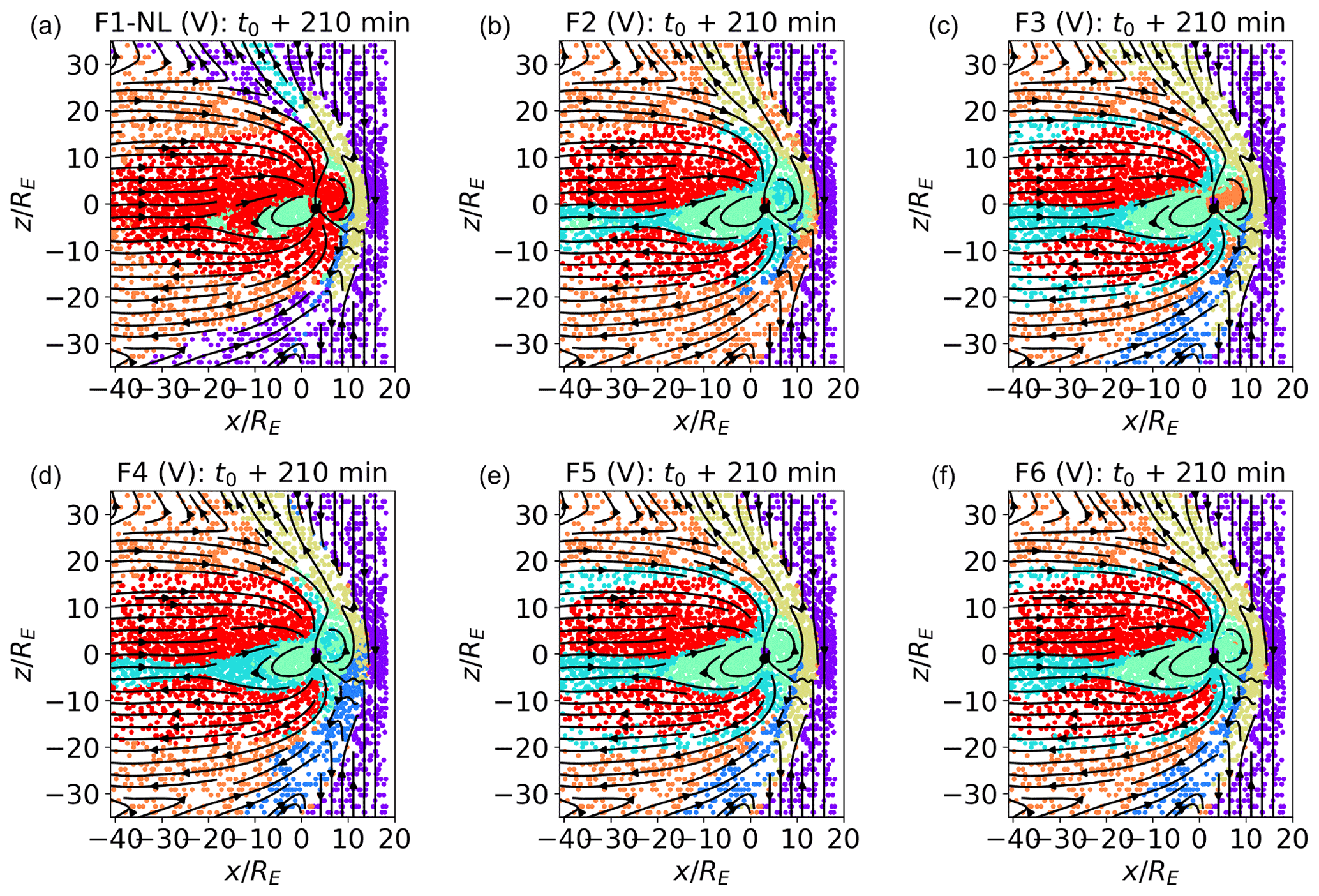
Figure 8Validation plots at t0+210 min in the plane from SOMs trained with feature sets F1 NL, F2, F3, F4, F5, and F6. F1 NL uses density, pressure, and temperature rather than their logarithms. F2 does not include log (n), and F3 does not include vx. F4, F5, and F6 add the logarithms of Alfvén speed vA, the Alfvénic Mach number MA, and the plasma beta β, respectively, to the feature set F1.
In Table 3 (second column – S), we report the percentage of data points classified in the same cluster as F1 for each of the feature sets of Table 1 for the validation data set at t0+210 min. In the third column (M), we consider clusters 1 and 4 as being a single cluster. In the previous analysis, we remarked that clusters 1 and 4 (the two magnetosheath clusters just downstream of the bow shock) map to the same kind of plasma. We take this into account when comparing classification results with F1. The metrics depicted in Table 3 cannot be used to assess the quality of the classification per se, since we are not comparing against ground truth but merely against another classification experiments. However, it gives us a quantitative measure of how much different classification experiments agree.
Comparing Fig. 8 with the Table 3 results, we see, as one could expect, that substandard feature sets (F1 NL, F2, and F3) agree less with the F1 classification than F4, F5, and F6. This is the case with F1 NL in particular, which exhibits the lower percentage of similarly classified points with respect to F1. We see that the agreement is particularly good with F5, as already noticed in Fig. 8.
Table 3Percentage of data points classified in the same cluster as F1 for the different feature sets (second column – S). In the third column (M), the two magnetosheath clusters just downstream of the bow shock, i.e., 1 and 4, are considered one. The data set used is the validation data set at time t0+210 min.
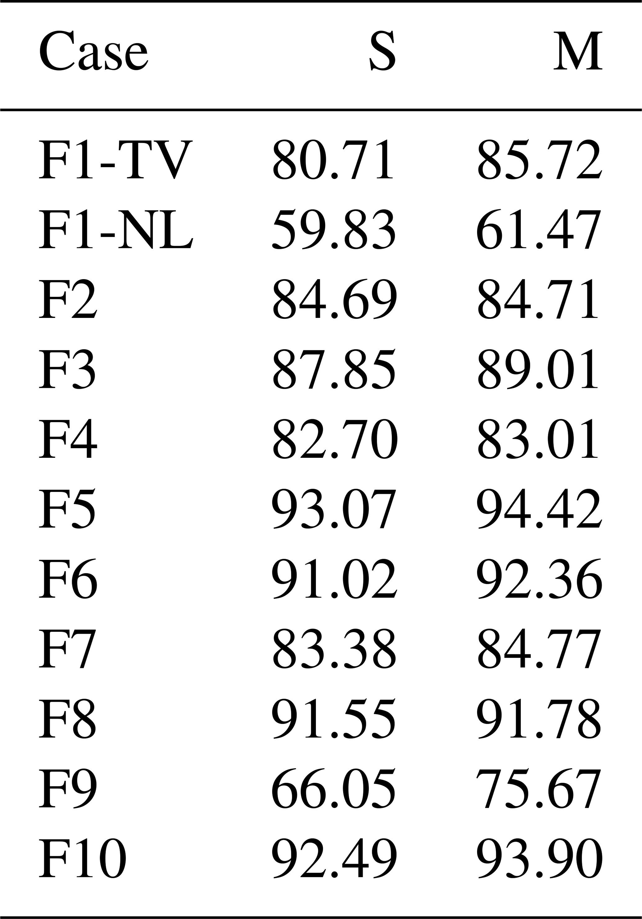
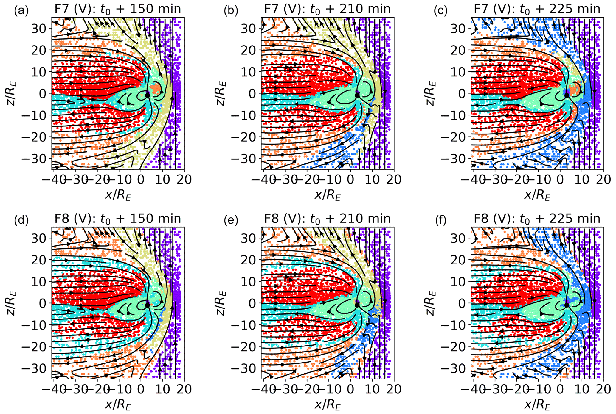
Figure 9Classification of validation data sets. plane at t0+150, 210, and 225 min for maps trained with the F7 and F8 feature sets. In F7, Bx, By, and Bz are not used for the map training. In F8, Bx, By, and Bz are clipped as described in Sect. 4.
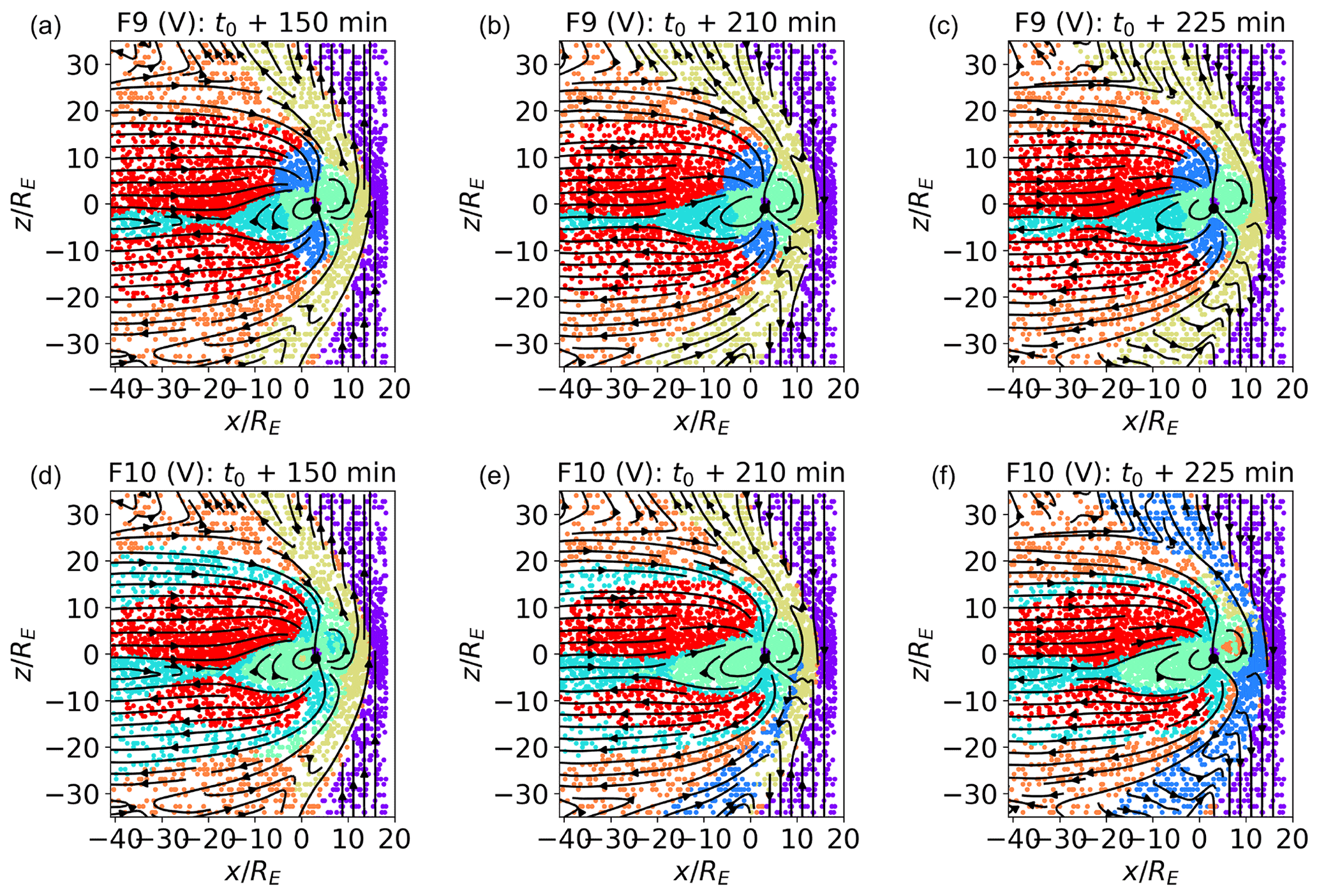
Figure 10Classification of validation data sets. plane at t0+150, 210, and 225 min for maps trained with the F9 and F10 feature sets. In F9 and F10, the module of the magnetic field, instead of its components, is used. In F9, is clipped, as described in Sect. 4. In F10, the logarithm of the module of the magnetic field is used.
When discussing Table 2, we remarked on the seemingly negligible role that the magnetic field components appear to have in determining the first three PCs, both when their values are not clipped (F1 feature set) and when they are (F8 feature set – B clipped). Here, we investigate if this reflects in classification results.
In Fig. 9, we show the classification of validation data sets at time t0+150, 210, and 225 min for the F7 feature set (panels a to c which do not include the magnetic field) and for F8 (panels d to f; where the magnetic field components are present but clipped as described in Sect. 2).
Comparing Fig. 9a–f with Fig. 6 (the validation plot for F1), we see that the identified clusters are indeed rather similar, including the variation with time of the outer magnetosheath clusters (see the discussion of Fig. 6). The main difference with Fig. 6 is the fact that, in the F7 case, the boundary layer cluster does not include most of the data points at the boundary between the lobe and magnetosheath plasma (this reflects in the percentage of similarly classified points in Table 3). The boundary layer cluster for F8, instead, corresponds quite well with F1. As already observed in Fig. 6, inner magnetospheric plasma is the most prone to misclassification in the validation test. In the case without magnetic field, in F7, as also in F1, the misclassified inner magnetospheric plasma is assigned to the inner magnetosheath cluster. In F8, it is assigned to either boundary layer plasma, at time t0+150 min, or to one of the magnetosheath clusters just downstream of the bow shock, at t0+225 min.
In Fig. 10a–c, we plot the classification results for the validation data sets for a map trained with feature set F9, where, instead of the three components of the magnetic field, we use only its magnitude, which is clipped as described above. We see that the green and blue clusters correspond to the regions of highest magnetic field closer to the Earth. The green and blue regions map to high- regions of the inner magnetosphere and lobes, respectively. We notice that, with this choice of features, the inner magnetospheric is consistently classified as such at different simulated times, contrary to what happened with feature sets previously discussed. The remaining inner magnetospheric plasma is classified together with the current sheet in the cyan cluster (while in F1 the inner magnetosphere and current sheets were clearly separated), which does not include plasma at the boundary between magnetosheath and lobes. Magnetosheath plasma just downstream of the bow shock is now classified in a single cluster. This classification is consistent with our knowledge of the magnetosphere and is very robust to temporal variation. However, it differs significantly from F1 classification, hence the low percentage of similarly classified points in Fig. 3.
F10, depicted in panels (d) to (f), looks remarkably similar to F1 (see also Table 3), especially in the internal regions, including the misclassification of some inner magnetospheric points as magnetosheath plasma at t0+225 min. The three magnetosheath clusters vary at the three different times depicted with respect to F1. This behavior, and the pattern of classification of magnetosheath plasma in F9, shows that the magnetic field is a feature of relevance in classification, especially for magnetosheath regions. F10 classification results show that the blue cluster in F9 originates from the clipping procedure. This somehow artificial procedure is, however, beneficial for inner magnetospheric points which are not misclassified in that case.
From this analysis, we learn important lessons on possible different outcomes of the classification procedure and on how to choose features for SOM training.
First of all, we can divide our feature sets into acceptable and substandard. Substandard feature sets are those, such as F1 NL and F2, that fail to separate plasma regions characterized by highly different plasma parameters. Examining the feature list in F1 NL, the reason for this is obvious. As one can see from a glance at Fig. 1g–l, only using a logarithmic representation allows us to appreciate how features that span orders of magnitude vary across magnetospheric regions. The lesson learned here is to use the data representation that more naturally highlights differences in the training data.
In F2, we excluded log (n) from the feature list, which expresses a large percentage of the variance of the training set, with poor classification results. A good rule of thumb is to always include these kind of variables into the training set.
With the exception of F1 NL and F2, all feature sets produce classification results which are, first of all, quite similar and generally reflect our knowledge of the magnetosphere well. Differences arise with the inclusion of extra variables, such as in Fig. 8d–f, where we add log (vA), log (MA), and log (β) to F1. All these quantities are derived from base simulation quantities and, while quite useful to the human scientist, do not seem to improve classification results here. In fact, occasionally they appear to degrade them; at least, this is the case in panel (d). These preliminary results therefore point in the direction of not including, somehow, duplicated information into the training set. One might even argue that the algorithm is smart enough to see such derived variables as long as the underlying variables are given.
Some feature sets, F1 (Figs. 4 and 6) and F9 (Fig. 10), raise our particular interest. Other feature sets, such as F5, F6, and F10, albeit interesting in their own right, essentially reproduce the results of F1. Both F1 and F9 produce classification results which, albeit somehow different, separate well-known magnetospheric regions. In F9, less information than in F1 is made available to the SOM; we use magnetic field magnitude rather than magnetic field components for the training. This results in two clusters, green and blue, that clearly correspond to high- points, whose values have been clipped as described above. This classification appears more robust to temporal variation than F1, perhaps because all three PCs (and not just the first two, as for F1) present well-defined multi-peaked distributions. This confirms the well-known fact that multi-peaked distributions of the input data are a very relevant factor in determining classification results.
We remark that these insights have to be further tested against different classification problems and may be somehow dependent on the classification procedure we chose in our work.
The growing amount of data produced by magnetospheric missions is amenable to the application of ML classification methods that could help in clustering the hundreds of gigabits of data produced every day by missions such as MMS into a small number of clusters characterized by similar plasma properties. Argall et al. (2020), for example, argue that ML models could be used to analyze magnetospheric satellite measurements in steps. First, region classifiers would separate between macro-regions, as the model we propose here does. Then, specialized event classifiers would target local, region-specific, processes.
Most of the classification works focusing on the magnetosphere consist of supervised classification methods. In this paper, instead, we present an unsupervised classification procedure for large-scale magnetospheric regions based on Amaya et al. (2020), where 14 years of ACE solar wind measurements are classified with a techniques based on SOMs. We choose an unsupervised classification method to avoid relying on a labeled training set, which risks introducing the bias of the labeling scientists into the classification procedure.
As a first step towards the application of this methodology to spacecraft data, we verify its performance on simulated magnetospheric data points obtained with the MHD code OpenGGCM-CTIM-RCM. We chose to start with simulated data since they offer several distinct advantages. First of all, we can, for the moment, bypass issues such as instrument noise and instrument limitations that are unavoidable with spacecraft data. Data analysis, de-noising, and preprocessing are fundamental components of ML activities. With simulations, we have access to data from a controlled environment that need minimal preprocessing and allow us to focus on the ML algorithm for the time being. Furthermore, the time/space ambiguity that characterizes spacecraft data is not present in simulations, and it is relatively easy to qualitatively verify classification performance by plotting the classified data in the simulated space. Performance validation can be an issue for magnetospheric unsupervised models working on spacecraft data. A model such as ours, trained and validated against simulated data points, could be part of an array of tests against which unsupervised classifications of magnetospheric data could be benchmarked.
The code we are using to produce the simulation is MHD. This means that kinetic processes are not included in our work and that variables available in observations, such as parallel and perpendicular temperatures and pressures and moments separated by species, are not available to us at this stage. This is certainly a limitation of our current analysis. This limitation is somehow mitigated by the fact that we are focusing on the classification of large-scale regions. Future work, on kinetic simulations and spacecraft data, will assess the impact of including kinetic variables among the classification features.
We obtain classification results, e.g., Figs. 4 and 10, that match our knowledge of the terrestrial magnetosphere, accumulated over decades of observations and scientific investigation, surprisingly well. The analysis of the SOM feature maps (Fig. 5) shows that the SOM node values associated with the different features represent the feature variability across the magnetosphere well, at least for the features that contribute most to determining the principal components used for the SOM training. Roaming across the feature map, we obtain hints of the processes characterizing the different clusters (see the discussion on plasma compression and heating across the bow shock).
Our validation analysis in Sect. 4.2 shows that the classification procedure is quite robust to temporal evolution in the magnetosphere. In particular, consistent results are produced with the opposite orientation of the Bz IMF component, which has profound consequences for the magnetospheric configuration.
Since this work is intended as a starting point rather than as a conclusive analysis, we report in detail on our exploration activities in terms of SOM hyperparameters (Sect. A) and feature sets (Sect. 4.3). We hope that this work will constitute a useful reference for colleagues working on similar issues in the future. In Sect. 4.3 in particular, we highlight our lessons learned when exploring classifications with different feature sets. They can be summarized as follows: (a) the most efficient features are characterized by multi-peaked distributions, (b) when feature values are spread over orders of magnitude, a logarithmic representation is preferable, (c) a preliminary analysis on the percent variance expressed by each potential feature can convey useful information on feature selection, (d) derived variables do not necessarily improve classification results, and (e) different choices of features can produce different but equally significant classification results.
In this work, we have focused on the classification of large-scale simulated regions. However, this is only one of the classification activities one may want to be able to perform on simulated, or observed, data. Other activities of interest may be the classification of mesoscale structures, such as depolarizing flux bundles or reconnection exhausts. This seems to be within the purview of the method, assuming that an appropriate number of clusters is used and that the simulations used to produce the data are resolved enough. To increase the chances of meaningful classification of the mesoscale structure, one may consider applying a second round of unsupervised classification on the points classified in the same, large-scale cluster. Another activity of interest could be the identification of points of transition between domains. Such an activity appears challenging in the absence, among the features used for the clustering, of spatial and temporal derivatives. We purposefully refrained from using them among our training features, since we are aiming for a local classification model that does not rely on higher-resolution sampling either in space or time.
Several points are left for future work. It should be investigated whether our classification procedure, while satisfactory at this stage, could be improved. Possible avenues of improvement could be the use of a dimensionality reduction technique that does not rely on linear correlation between the features or the use of dynamic (Rougier and Boniface, 2011b) rather than static SOMs.
As an example, in Amaya et al. (2020), more advanced preprocessing techniques were experimented with, which will most probably prove useful when we will move to the more challenging environment of spacecraft observations (as opposed to simulations). Furthermore, Amaya et al. (2020) employed windows of time in the classification, which we have not used in this work in favor of an instantaneous approach. In future work, we intend to verify which approach gives better results.
It should also be verified whether similar modifications reduce the misclassification of inner magnetospheric points observed with a number of feature sets, including F1, and if they reduce the importance or outright eliminate the need of looking for optimal sets of training features.
The natural next step of our work is the classification of spacecraft data. There, many more variables not included in an MHD description will be available. They will probably constitute both a challenge and an opportunity for unsupervised classification methods and will allow us to attempt classification aimed at smaller-scale structure, where such variables are expected to be essential. Such procedures will be aimed not at competing in accuracy with supervised classifications, but they will hopefully be pivotal in highlighting new processes.
SOMs are characterized by several hyperparameters (Sect. 3), including the number of rows Lr and of columns Lc, the initial learning rate ϵ0, and the initial lattice neighbor width σ0. In this section, we explore how changing the hyperparameters changes the convergence of the map. The features we use are F1 in Table 1. Libraries for the automatic selection of SOM hyperparameters are available; however, we prefer, at this stage, manual hyperparameter selection to familiarize ourselves with the classification procedure and expected outcomes in different simulated scenarios.
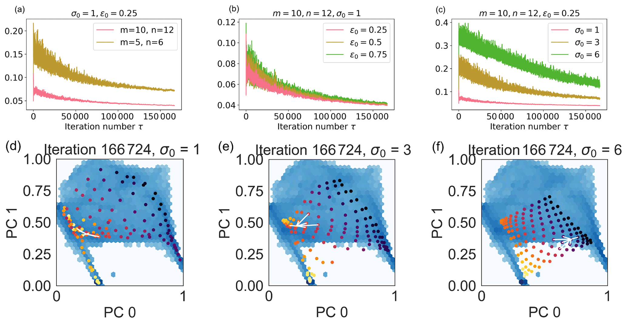
Figure A1Hyperparameter selection. In panels (a)–(c), evolution of the quantization error QE with the number of iterations τ changing the SOM node number (q; panel a), initial learning rate (ϵ0; panel b), and initial lattice neighbor width (σ0; panel c). In panels (d)–(f), code words 0 and 1 associated with SOM nodes (in bright colors) are superimposed to the input point distribution (blue background) for a SOM with nodes, initial learning rate ϵ0=0.25, and initial lattice neighbor width σ0=1 (d), with 3 (e), and 6 (f) at the final iteration. In the animation, we show the evolution of the node positions with the iteration number. The white lines connect node (3,3) to its nearest neighbors.
In Fig. A1, we see the evolution of the quantization error QE (Eq. 4) with the number of iterations, τ, changing the number of nodes (panel a), the initial learning rate ϵ0 (panel b), and the initial lattice neighbor width σ0 (panel c). The number of iterations used is larger than three epochs to ensure that each training data point is presented to the SOM an adequate number of times. In Fig. A1a–c, the standard deviation of the quantization errors strongly reduces as a function of the iteration number, which is a consequence of the iteration-number-dependent evolution we impose on the learning rate and on the lattice neighbor width.
A more recent version of the SOM that does not depend on the iteration number has been proposed by Rougier and Boniface (2011a). This dynamic self-organizing map (DSOM) has been successfully used by Amaya et al. (2020) to classify different solar wind types. In this work, we have decided to use the original SOM algorithm as the results already show very good convergence to meaningful classes.
In Fig. A1a, we observe that the quantization error decreases with an increasing number of nodes. This is not surprising since the quantization error measures the average distance between each input data point and its BMU. With a larger number of nodes, this distance naturally decreases. In panel b, we see that decreasing the initial learning rate ϵ0 does not change the average error value significantly. However, smaller oscillations around the average value are observed with lower learning rates. In panel (c), we observe that changing the initial lattice neighbor width σ0 has a significant impact on the quantization error. The reason is clear when looking at panels (d) to (f) and the respective animations.
In panels (d) to (f), we depict the code words associated with the SOM nodes obtained with σ0=1 (panel d), 3 (panel e), and 6 (panel f) as colored dots. Each of the brightly colored dots corresponds to one of the wi, with and (defined in Sect. 3). The code words are depicted in the reduced space obtained after dimensionality reduction of the original features with PCA. Of the three principal components, PCs, that characterize the reduced space, we show here only the PC0 vs. PC1 distribution. The darker, continuous background shows the distribution of the code words associated with the input points (i.e., the xτ in Sect. 3), again for PC 0 and 1. We see in panel (d) that the nodes (i.e., the dots) superimpose the data distribution well. In particular, higher node density is observed in correspondence with the darker areas of the underlying distribution where the data point density is higher. There are no SOM nodes in the white area where data points are not present. With larger values of σ0, panels (e) and (f), we observe that the node distribution maps the data distribution less optimally. Larger lattice widths mean that a single new data point significantly affects a larger number of SOM nodes. High values of σ0, then, drag a large number of map nodes closer to the location in the PC0 vs. PC1 plot of every new data point. We see this in the animation of panels (d) to (f) of Fig. A1, where the SOM nodes move across the PC0 vs. PC1 plane as a function of the iteration number τ for the different lattice neighbor width values.
At the end of this manual hyperparameter investigation, we choose , ϵ0=0.25, and σ0=1 for our maps.
In this Appendix, we explore how the classification of magnetospheric regions changes when the number of k-means clusters k used to classify the SOM nodes is reduced. In all the cases described here (as in the rest of the paper, unless otherwise specified), the SOM map is obtained with the F1 features in Table 1 and with , ϵ0=0.25, and σ0=1. The k=7 case is further described in Sect. 4.1.
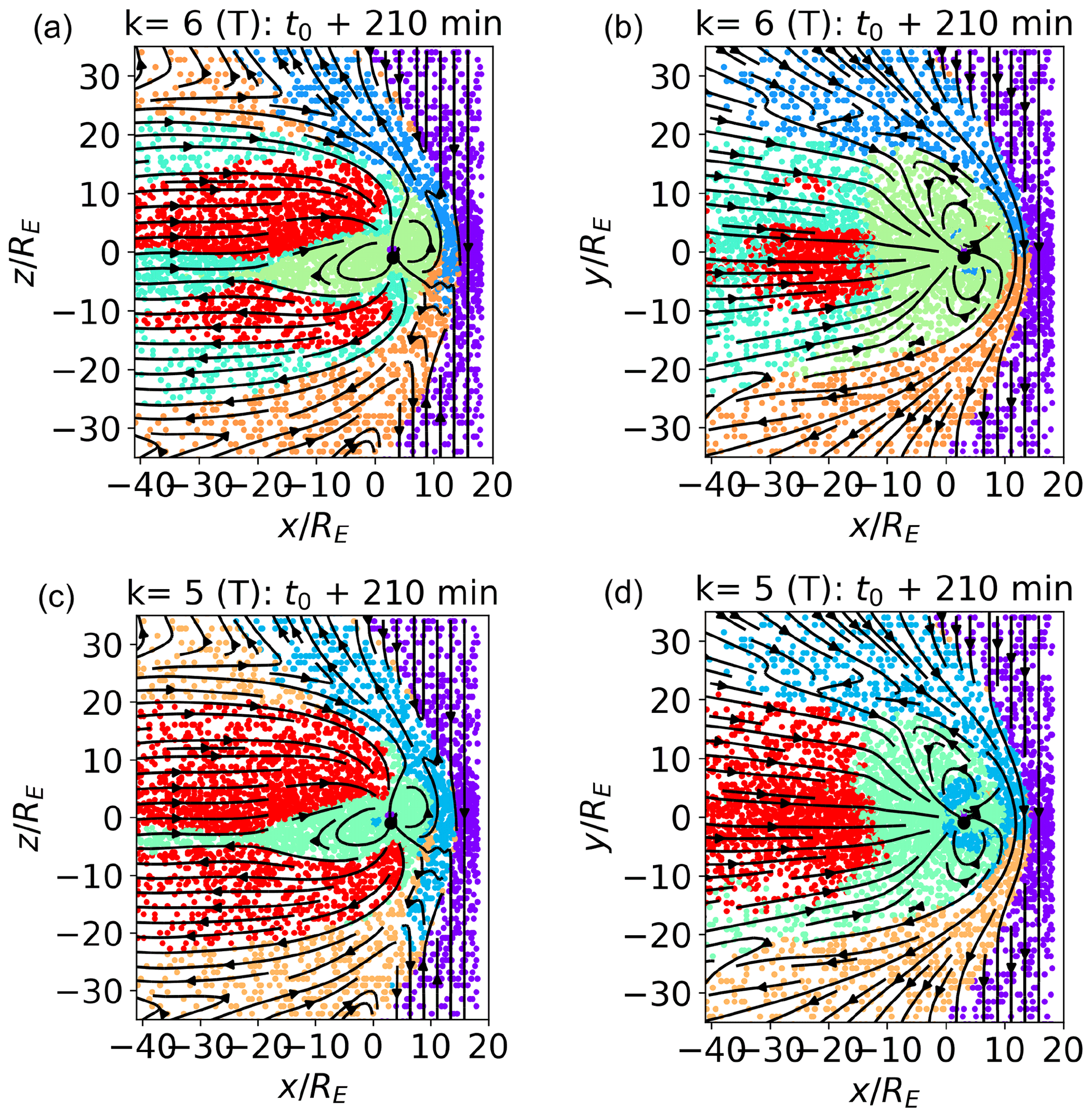
Figure B1 (a, c) and (b, d) cuts with k=6 (a, b) and k=5 (c, d). The training data set is depicted.
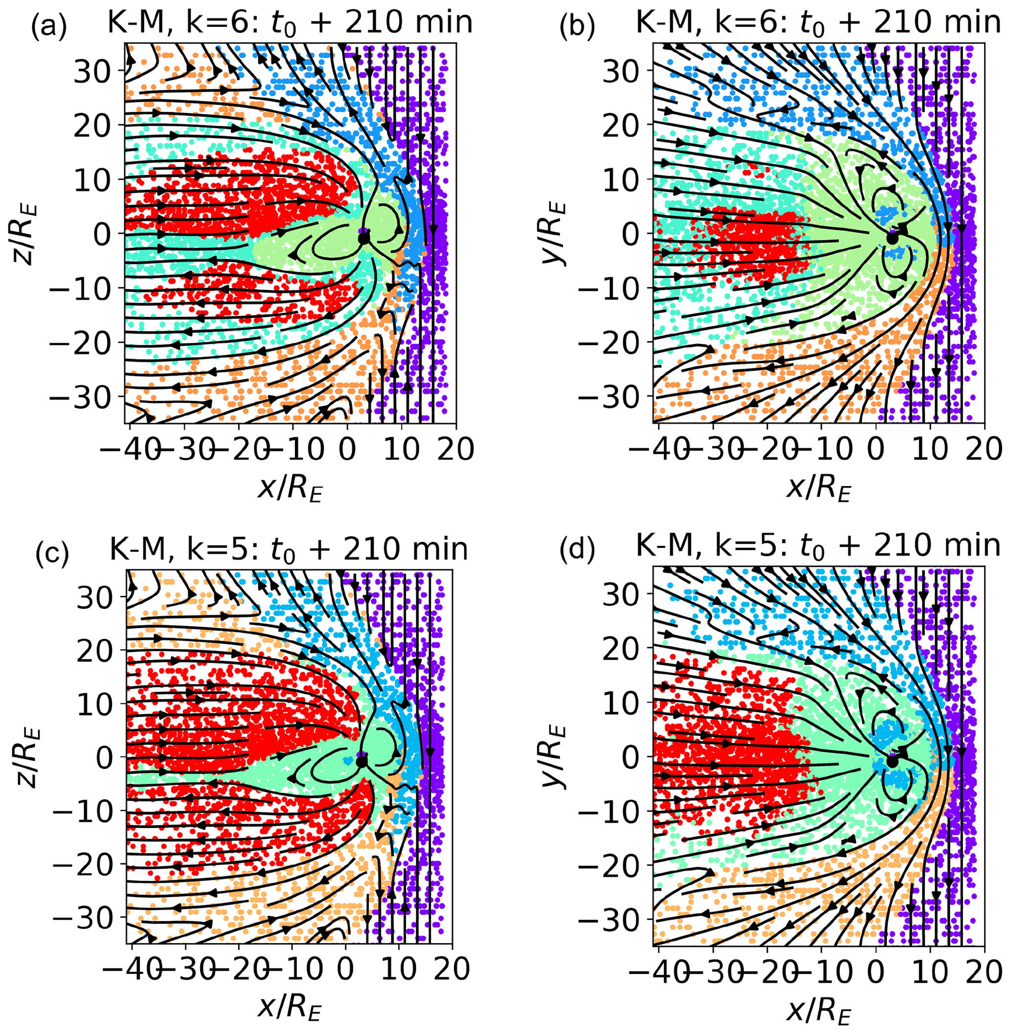
Figure B2The k-means classification with k=6 (a, b) and k=5 (c, d) for the data points in the meridional (a, c) and equatorial (b, d) planes. The training data set is depicted.
In Fig. B1, we show the classification results with k=6 (panels a and b) and k=5 (panels c and d). The data depicted are the training data set. The k=7 case is depicted in Fig. 4. In panels (a) and (c) and (b) and (d), we depict the simulated meridional and equatorial plane, with the data points colored according to their respective clusters. Following the changes from k=7 to k=5 allows us to have better insights into our classification procedure and also highlights which of the magnetospheric regions are more similar in terms of plasma parameters.
In panels (a) and (b), we plot k=6. Comparing them with Fig. 4, we see that reducing the number of clusters of one unit merges the three magnetosheath clusters (brown, orange, and blue) into two (blue and orange). This is consistent with the fact that the magnetosheath clusters, and in particular clusters 4 (brown) and 1 (blue) with k=7, map to quite similar plasmas. The more internal clusters (inner magnetosphere, boundary layers, and lobes) are not affected.
Further reducing to number of clusters to k=5, instead, mostly affects the internal clusters. The boundary layer cluster disappears, and the points that mapped to it are, quite sensibly, assigned to the clusters mapping to inner magnetospheric (this is mostly the case for current sheet plasma), magnetosheath or lobe plasma (the points at the boundary between lobes and magnetosheath). Some inner magnetosphere points are misclassified as magnetosheath plasma. With both k=6 and k=5, the solar wind cluster, which differs the most from the others, is left unaltered.
In Fig. B2, we depict the pure k-means classification with k=6 (panels a and b) and k=5 (panels c and d) for data points in the meridional (panels a and c) and equatorial (panels b and d) planes to be compared with the SOM classification depicted in Fig. B1. We do not notice any significant difference between the SOM and k-means classification for k=5; for k=6, we notice, as already with k=7, that the SOM classification reduces the misclassification of internal magnetospheric points.
In summary, decreasing k from a larger to a smaller number produces a more coarse-grained classification. Generally speaking, every time k is decreased, the three clusters mapping to the most similar plasma reorganize and coalesce into two. This process shows which magnetospheric regions are most similar.
OpenGGCM-CTIM-RCM is available at the Community Coordinated Modeling Center at NASA/GSFC for model runs on demand (http://ccmc.gsfc.nasa.gov, last access: 1 October 2021).
The simulation data set (KUL_OpenGGCM) is available from Cineca AIDA-DB, the simulation repository associated with the H2020 AIDA project. In order to access the meta-information and the link to the KUL_OpenGGCM simulation, please refer to the tutorial at http://aida-space.eu/AIDAdb-iRODS (last access: 1 October 2021).
The supplement related to this article is available online at: https://doi.org/10.5194/angeo-39-861-2021-supplement.
MEI ran the simulation and performed the analysis. JA assisted with the analysis. JR and BF provided the OpenGGCM-CTIM-RCM code and the support when using it. RD and GL supported the investigation and provided useful advice.
The contact author has declared that neither they nor their co-authors have any competing interests.
Publisher's note: Copernicus Publications remains neutral with regard to jurisdictional claims in published maps and institutional affiliations.
We acknowledge funding from the European Union's Horizon 2020 research and innovation programme (grant no. 776262; AIDA – Artificial Intelligence for Data Analysis; http://www.aida-space.eu, last access: 1 October 2021). Work at UNH was also supported by the National Science Foundation (grant no. AGS-1603021) and by the Air Force Office of Scientific Research (grant no. FA9550-18-1-0483). The OpenGGCM-CTIM-RCM simulations were performed on the supercomputer Marconi Broadwell (Cineca, Italy) under a PRACE allocation. We acknowledge the use of the MiniSom (, ), scikit-learn (Pedregosa et al., 2011), pandas, and matplotlib python packages.
This research has been supported by the Horizon 2020 (AIDA (grant no. 776262)).
This open-access publication was funded by Ruhr-Universität Bochum.
This paper was edited by Minna Palmroth and reviewed by Markus Battarbee and one anonymous referee.
Amaya, J., Dupuis, R., Innocenti, M. E., and Lapenta, G.: Visualizing and Interpreting Unsupervised Solar Wind Classifications, Front. Astron. Space Sci., 7, 66, https://doi.org/10.3389/fspas.2020.553207, 2020. a, b, c, d, e, f
Anderson, B. J., Korth, H., Welling, D. T., Merkin, V. G., Wiltberger, M. J., Raeder, J., Barnes, R. J., Waters, C. L., Pulkkinen, A. A., and Rastaetter, L.: Comparison of predictive estimates of high-latitude electrodynamics with observations of global-scale Birkeland currents, Space Weather, 15, 352–373, https://doi.org/10.1002/2016sw001529, 2017. a
Angelopoulos, V.: The THEMIS mission, in: The THEMIS mission, 5–34, Springer, New York, NY, 2009. a
Argall, M. R., Small, C. R., Piatt, S., Breen, L., Petrik, M., Kokkonen, K., Barnum, J., Larsen, K., Wilder, F. D., Oka, M., Paterson, W. R., Torbert, R. B., Ergun, R. E., Phan, T., Giles, B. L., and Burch, J. L.: MMS SITL Ground Loop: Automating the Burst Data Selection Process, Front. Astron. Space Sci., 7, 54, https://doi.org/10.3389/fspas.2020.00054, 2020. a, b, c
Armstrong, J. A. and Fletcher, L.: Fast solar image classification using deep learning and its importance for automation in solar physics, Solar Phys., 294, 80, https://doi.org/10.1007%2Fs11207-019-1473-z, 2019. a
Baker, D., Riesberg, L., Pankratz, C., Panneton, R., Giles, B., Wilder, F., and Ergun, R.: Magnetospheric multiscale instrument suite operations and data system, Space Sci. Rev., 199, 545–575, 2016. a
Bakrania, M. R., Rae, I. J., Walsh, A. P., Verscharen, D., and Smith, A. W.: Using dimensionality reduction and clustering techniques to classify space plasma regimes, Front. Astron. Space Sci., 7, 80, https://doi.org/10.3389/fspas.2020.593516, 2020. a
Balasis, G., Aminalragia-Giamini, S., Papadimitriou, C., Daglis, I. A., Anastasiadis, A., and Haagmans, R.: A machine learning approach for automated ULF wave recognition, J. Space Weather Spac., 9, A13, https://doi.org/10.1051/swsc/2019010, 2019. a
Berchem, J., Raeder, J., and Ashour-Abdalla, M.: Reconnection at the magnetospheric boundary: Results from global MHD simulations, in: Physics of the Magnetopause, edited by: Sonnerup, B. U. and Song, P., AGU Geophysical Monograph, 90, 205, https://doi.org/10.1029/GM090p0205, 1995. a
Bishop, C. M.: Pattern recognition, Mach. Learn., 128, 2006. a
Bobra, M. G. and Couvidat, S.: Solar flare prediction using SDO/HMI vector magnetic field data with a machine-learning algorithm, Astrophys. J., 798, 135, https://doi.org/10.1088/0004-637x/798/2/135, 2015. a
Bothmer, V. and Daglis, I. A.: Space weather: physics and effects, Springer Science & Business Media, Berlin Heidelberg, 2007. a
Breuillard, H., Dupuis, R., Retino, A., Le Contel, O., Amaya, J., and Lapenta, G.: Automatic Classification of Plasma Regions in Near-Earth Space With Supervised Machine Learning: Application to Magnetospheric Multi Scale 2016–2019 Observations, Front. Astronom. Space Sci., 7, 55, https://doi.org/10.3389/fspas.2020.00055, 2020. a
Burch, J., Moore, T., Torbert, R., and Giles, B.: Magnetospheric multiscale overview and science objectives, Space Sci. Rev., 199, 5–21, 2016. a
Camporeale, E.: The challenge of machine learning in space weather: Nowcasting and forecasting, Space Weather, 17, 1166–1207, 2019. a
Connor, H. K., Zesta, E., Fedrizzi, M., Shi, Y., Raeder, J., Codrescu, M. V., and Fuller-Rowell, T. J.: Modeling the ionosphere-thermosphere response to a geomagnetic storm using physics-based magnetospheric energy input: OpenGGCM-CTIM results, J. Space Weather Spac., 6, A25, https://doi.org/10.1051/swsc/2016019, 2016. a
da Silva, D., Barrie, A., Shuster, J., Schiff, C., Attie, R., Gershman, D., and Giles, B.: Automatic Region Identification over the MMS Orbit by Partitioning nT space, arXiv preprint arXiv:2003.08822, 2020. a
Dorelli, J. C.: A new look at driven magnetic reconnection at the terrestrial subsolar magnetopause, J. Geophys. Res., 109, A12, https://doi.org/10.1029/2004ja010458, 2004. a
Escoubet, C. P., Fehringer, M., and Goldstein, M.: Introduction: The Cluster mission, Ann. Geophys., 19, 1197–1200, https://doi.org/10.5194/angeo-19-1197-2001, 2001. a
Ferdousi, B. and Raeder, J.: Signal propagation time from the magnetotail to the ionosphere: OpenGGCM simulation, J. Geophys. Res.-Space Phys., 121, 6549–6561, 2016. a
Florios, K., Kontogiannis, I., Park, S.-H., Guerra, J. A., Benvenuto, F., Bloomfield, D. S., and Georgoulis, M. K.: Forecasting solar flares using magnetogram-based predictors and machine learning, Solar Phys., 293, 28, https://doi.org/10.1007/s11207-018-1250-4, 2018. a
Ge, Y. S., Raeder, J., Angelopoulos, V., Gilson, M. L., and Runov, A.: Interaction of dipolarization fronts within multiple bursty bulk flows in global MHD simulations of a substorm on 27 February 2009, J. Geophys. Res., 116, A00I23, https://doi.org/10.1029/2010JA015758, 2011. a
Goodfellow, I., Bengio, Y., and Courville, A.: Deep learning, MIT press, Cambridge, MA, 2016. a
Kohonen, T.: Self-organized formation of topologically correct feature maps, Biol. Cybern., 43, 59–69, 1982. a
Kohonen, T.: MATLAB Implementations and Applications of the Self-Organizing Map, Unigrafia Oy, Helsinki, Finland, 2014. a, b, c, d, e
Laakso, H., Perry, C., McCaffrey, S., Herment, D., Allen, A., Harvey, C., Escoubet, C., Gruenberger, C., Taylor, M., and Turner, R.: Cluster active archive: Overview, The cluster active archive, in: The Cluster Active Archive, Springer Netherlands, Dordrecht, 3–37, 2010. a
Lapenta, G., Zhukov, A., and van Driel-Gesztelyi, L.: Solar Wind at the Dawn of the Parker Solar Probe and Solar Orbiter Era, Solar Phys., 295, 103, https://doi.org/10.1007/s11207-020-01670-8, 2020. a
Lloyd, S.: Least squares quantization in PCM, IEEE transactions on information theory, 28, 129–137, 1982. a
Love, T., Neukirch, T., and Parnell, C. E.: Analyzing AIA Flare Observations Using Convolutional Neural Networks, Front. Astron. Space Sci., 7, 34, https://doi.org/10.3389/fspas.2020.00034, 2020. a
Millas, D., Innocenti, M. E., Laperre, B., Raeder, J., Poedts, S., and Lapenta, G.: Domain of Influence Analysis: Implications for Data Assimilation in Space Weather Forecasting, Front. Astron. Space Sci., 7, 73, https://doi.org/10.3389/fspas.2020.571286, 2020. a
Moretto, T., Vennerstrom, S., Olsen, N., Rastaetter, L., and Raeder, J.: Using global magnetospheric models for simulation and interpretation of SWARM external field measurements, Earth Planets Space, 58, 439–449, 2006. a
Nguyen, G., Aunai, N., Michotte de Welle, B., Jeandet, A., and Fontaine, D.: Automatic detection of the Earth Bow Shock and Magnetopause from in-situ data with machine learning, Ann. Geophys. Discuss. [preprint], https://doi.org/10.5194/angeo-2019-149, 2019. a
Nishizuka, N., Sugiura, K., Kubo, Y., Den, M., Watari, S., and Ishii, M.: Solar flare prediction model with three machine-learning algorithms using ultraviolet brightening and vector magnetograms, Astrophys. J., 835, 156, https://doi.org/10.3847/1538-4357/835/2/156, 2017. a
Olshevsky, V., Khotyaintsev, Y. V., Divin, A., Delzanno, G. L., Anderzen, S., Herman, P., Chien, S. W., Avanov, L., and Markidis, S.: Automated classification of plasma regions using 3D particle energy distribution, arXiv preprint arXiv:1908.05715, 2019. a
Pedregosa, F., Varoquaux, G., Gramfort, A., Michel, V., Thirion, B., Grisel, O., Blondel, M., Prettenhofer, P., Weiss, R., Dubourg, V., Vanderplas, J., Passos, A., Cournapeau, D., Brucher, M., Perrot, M., and Duchesnay, E.: Scikit-learn: Machine Learning in Python, J. Mach. Learn. Res., 12, 2825–2830, 2011. a
Raeder, J.: Global Magnetohydrodynamics – A Tutorial, in: Space Plasma Simulation, edited by: Büchner, J., Dum, C. T., and Scholer, M., Springer Verlag, Berlin Heidelberg New York, https://doi.org/10.1007/3-540-36530-3_11, 2003. a, b
Raeder, J.: Flux Transfer Events: 1. generation mechanism for strong southward IMF, Ann. Geophys., 24, 381–392, https://doi.org/10.5194/angeo-24-381-2006, 2006. a
Raeder, J. and Lu, G.: Polar cap potential saturation during large geomagnetic storms, Adv. Space Res., 36, 1804–1808, https://doi.org/10.1016/j.asr.2004.05.010, 2005. a
Raeder, J., McPherron, R. L., Frank, L. A., Paterson, W. R., Sigwarth, J. B., Lu, G., Singer, H. J., Kokubun, S., Mukai, T., and Slavin, J. A.: Global simulation of the Geospace environment modeling substorm challenge event, J. Geophys. Res., 106, 381, https://doi.org/10.1029/2000JA000605, 2001a. a
Raeder, J., Wang, Y. L., Fuller-Rowell, T. J., and Singer, H. J.: Global simulation of space weather effects of the Bastille Day storm, Solar Phys., 204, 325, 2001b. a
Raeder, J., Zhu, P., Ge, Y., and Siscoe, G. L.: OpenGGCM Simulation of a Substorm: Axial Tail Instability and Ballooning Mode Preceding Substorm Onset, J. Geophys. Res., 115, A00l16, https://doi.org/10.1029/2010JA015876, 2010. a
Raptis, S., Aminalragia-Giamini, S., Karlsson, T., and Lindberg, M.: Classification of Magnetosheath Jets Using Neural Networks and High Resolution OMNI (HRO) Data, Front. Astron. Space Sci., 7, 24, https://doi.org/10.3389/fspas.2020.00024, 2020. a
Rougier, N. and Boniface, Y.: Dynamic self-organising map, Neurocomputing, 74, 1840–1847, https://doi.org/10.1016/J.NEUCOM.2010.06.034, 2011a. a
Rougier, N. and Boniface, Y.: Dynamic self-organising map, Neurocomputing, 74, 1840–1847, 2011b. a
Satopaa, V., Albrecht, J., Irwin, D., and Raghavan, B.: Finding a “Kneedle” in a Haystack: Detecting Knee Points in System Behavior, in: 2011 31st International Conference on Distributed Computing Systems Workshops, 20–24 June 2011, Minneapolis, MN, USA, 166–171, 2011. a
Shi, Q. Q., Hartinger, M., Angelopoulos, V., Tian, A., Fu, S., Zong, Q.-G., Weygand, J. M., Raeder, J., Pu, Z., Zhou, X., Dunlop, M., Liu, W., Zhang, H., Yao, Z., and Shen, X.: Solar wind pressure pulse-driven magnetospheric vortices and their global consequences, J. Geophys. Res.-Space Phys., 119, 4274–4280, https://doi.org/10.1002/2013ja019551, 2014. a
Shlens, J.: A tutorial on principal component analysis, arXiv preprint arXiv:1404.1100, 2014. a
Stone, E. C., Frandsen, A., Mewaldt, R., Christian, E., Margolies, D., Ormes, J., and Snow, F.: The advanced composition explorer, Space Sci. Rev., 86, 1–22, 1998. a
Vennerstrom, S., Moretto, T., Rastaetter, L., and Raeder, J.: Field-aligned currents during northward interplanetary field: Morphology and causes, J. Geophys. Res., 110, A06205, https://doi.org/10.1029/2004JA010802, 2005. a
Vettigli, G.: MiniSom: minimalistic and NumPy-based implementation of the Self Organizing Map, gitHub, available at: https://github.com/JustGlowing/minisom/, last access: 1 October 2021. a
Villmann, T. and Claussen, J. C.: Magnification control in self-organizing maps and neural gas, Neural Computation, 18, 446–469, 2006. a
Zhou, X.-Z., Ge, Y. S., Angelopoulos, V., Runov, A., Liang, J., Xing, X., Raeder, J., and Zong, Q.-G.: Dipolarization fronts and associated auroral activities: 2. Acceleration of ions and their subsequent behavior, J. Geophys. Res.-Space Phys., 117, 1, https://doi.org/10.1029/2012ja017677, 2012. a
Zhu, P., Raeder, J., Germaschewski, K., and Hegna, C. C.: Initiation of ballooning instability in the near-Earth plasma sheet prior to the 23 March 2007 THEMIS substorm expansion onset, Ann. Geophys., 27, 1129–1138, https://doi.org/10.5194/angeo-27-1129-2009, 2009. a
- Abstract
- Introduction
- Global magnetospheric simulations
- Self-organizing maps: a recap
- Methodology and results
- Conclusions
- Appendix A: Exploring the SOM hyperparameters: node number, initial lattice neighbor width, and learning rate
- Appendix B: Classification evolution with the cluster number
- Code availability
- Data availability
- Author contributions
- Competing interests
- Disclaimer
- Acknowledgements
- Financial support
- Review statement
- References
- Supplement